Bootstrap Front End Framework for Web Design
Last updated on April 20, 2026 by RGB Web Tech
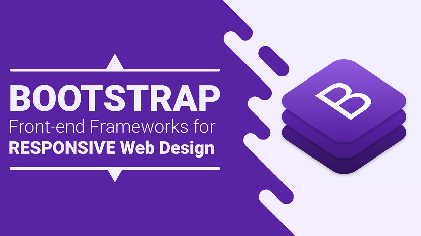
Bootstrap is a free and open-source CSS framework directed at responsive, mobile-first front-end web development. It contains CSS- and (optionally) JavaScript-based design templates for typography, forms, buttons, navigation, and other interface components.
Highlights:
- Author: Mark Otto, Jacob Thornton
- Developer's: Bootstrap Core Team
- Initial release: August 19, 2011
- Written in: HTML, CSS, Less (v3), Sass (v4) and JavaScript
- Platform: Web platform
- Open-source: Yes
- Website: https://getbootstrap.com
- Alexa Rank: 2,108
Bootstrap 4 Alpha 6 Features:
1. Rewritten grid system in flexbox: They improved the grid system with three major changes. Here, one can disable the grid classes by the SASS variable. You can add a grid customization section to the documents. You will see also witness simplified grid classes. These changes are available in both standard and flexbox grids.
2. Flexbox by default: Along with flexbox being the default system. There are flexbox grids, also available, apart from standard ones. And new flexbox alignment utility classes at hand for distributing items as well.
3. IE9 support: Bootstrap CSS has released this long-awaited update of IE9 support.
4. Forms: With development to Alpha 4, there are significant changes in forms. There are necessary improvements in sizing, alignment, and component layout. The ‘fresh form validation and help text options are ready. And the documentation for forms is simplified too.
5. Automatic equal-width grid columns: Breakpoint-specific column classes can be employed for columns with equal width.
6. Updated and improved Navbar: Earlier there were certain styles for nav components that could not be set by variables. This update takes care of that and also adds some new features to it.
7. Auto margins for easy spacing: They improved the auto margins for easy spacing.
8. Change in system fonts: Helvetica/Arial font was old system fonts. They are replaced with a system font stack of modern, and strong fonts. This is done for companies like Apple, Google, Mac, to target the latest devices. Although, there is no such update available for Linux users.
Pros:
- Massive community support.
- Widest variety of themes.
- Best browser capability.
- Has both a fluid and fixed pattern grid system.
- More development tools available.
- Many popular websites are built on this framework.
- Superiority in mobile support.
- Most of the celebrated custom web development companies prefer this tool.
Cons:
- Not as lightweight when compared to others. Out-of-the-box file size of 276 KB due to an excessive number of rarely used styles.
- Difficult to use jQuery plugins.
- Websites are easily recognizable.
- The excessive number of HTML classes and DOM elements can be messy and confusing
Popular Brands Using Bootstrap:
- Lyft
- Vogue
- Riot Design
- Newsweek
Ideal for: Beginners and those who prefer a robust front-end framework.
Bootstrap Alternatives: If you want to explore more responsive Front-end Frameworks for your upcoming projects than you can Visit Here.
Bootstrap Alternatives: If you want to explore bootstrap alternatives. Visit Here
Bootstrap, originally named Twitter Blueprint, was developed by Mark Otto and Jacob Thornton at Twitter as a framework to encourage consistency across internal tools. Before Bootstrap, various libraries were used for interface development, which led to inconsistencies and a high maintenance burden.
After a few months of development by a small group, many developers at Twitter began to contribute to the project as a part of Hack Week, a hackathon-style week for the Twitter development team. It was renamed from Twitter Blueprint to Bootstrap and released as an open-source project on August 19, 2011. It has continued to be maintained by Mark Otto, Jacob Thornton, and a small group of core developers, as well as a large community of contributors.
Bootstrap 2
On January 31, 2012, Bootstrap 2 was released, which added built-in support for Glyphicons, several new components, as well as changes to many of the existing components. This version supports responsive web design, meaning the layout of web pages adjusts dynamically, taking into account the characteristics of the device used (whether desktop, tablet, or mobile phone).
Bootstrap 3
The next major version, Bootstrap 3, was released on August 19, 2013. It redesigned components to use flat design and a mobile-first approach.
Bootstrap 4
Mark Otto announced Bootstrap 4 on October 29, 2014. The first alpha version of Bootstrap 4 was released on August 19, 2015. The first beta version was released on 10 August 2017. Mark suspended work on Bootstrap 3 on September 6, 2016, to free up time to work on Bootstrap 4. Bootstrap 4 was finalized on January 18, 2018.
Significant changes include:
- Major rewrite of the code.
- Replacing Less with Sass.
- Addition of Reboot, a collection of element-specific CSS changes in a single file, based on Normalize.
- Dropping support for IE8, IE9,[contradictory] and iOS 6.
- CSS Flexible Box support.
- Adding navigation customization options.
- Adding responsive spacing and sizing utilities.
- Switching from the pixels unit in CSS to root ems.
- Increasing global font size from 14px to 16px.
- Dropping the panel, thumbnail, pager, and well components.
- Dropping the Glyphicons icon font.
- Huge number[quantify] of utility classes.
- Improved form styling, buttons, drop-down menus, media objects, and image classes.
- Bootstrap 4 supports the latest versions of Google Chrome, Firefox, Internet Explorer, Opera, and Safari (except on Windows). It additionally supports back to IE9 [contradictory] and the latest Firefox Extended Support Release (ESR).
Bootstrap 5
Bootstrap 5 is a updated version of bootstrap4 and Bootstrap 5 alpha was officially released on June 16, 2020 after several months of refining. With all of the major changes in this version, the Boostrap 5 development team informed the users that the current version is still in alpha version thus, breaking changes will continue to occur until the first beta is released so it’s better to always check the open issues and pull requests on their official GitHub repository for open questions and feedback.
Summary of the most important changes:
- jQuery was removed
- Switch to Vanilla JavaScript
- Drop Internet Explorer 10 and 11 support
- Improved grid system
- Improved documentation
- Improved modularity
- Improved forms
- New responsive font
- New utilities & helpers
- Easier customization & theming
- Lighter package
- New API available
Bootstrap Alternatives: If you want to explore more responsive Front-end Frameworks for your upcoming projects than you can Visit Here.
If you found this article helpful, we encourage you to share it on your social media platforms—because sharing is caring! For more information about article submissions on our website, feel free to reach out to us via email.
Send an email
Written by RGB Web Tech
Latest Technology Trends
Latest technology trends shaping the future, including AI advancements, blockchain innovation, 5G connectivity, IoT integration, and sustainable tech solutions. Explore breakthroughs in quantum computing, cybersecurity, augmented reality, and edge computing. Stay ahead with insights into transformative technologies driving innovation across industries and revolutionizing how we live, work, and connect.
Foundation Front-End Frameworks for Web Deisgn
Last updated on April 20, 2026 by RGB Web Tech
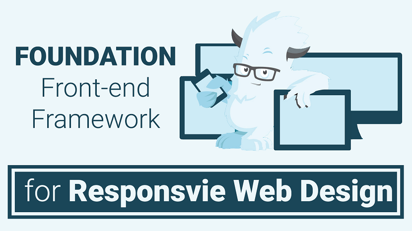
Foundation is a CSS framework designed by ZURB in September 2011. It has a slightly more advanced interface compared to other frameworks. Foundation is compatible on multiple browsers and hand held devices. The responsive menu is one of its greatest assets. The menu is incredible when it comes to functionality and can also be easily styled using CSS. This responsive framework allows designers and developers to create elegant websites with more of a design-it-yourself approach. It has responsive grid ( HTML & CSS) UI components, templates, and code snippets, including typography, forms, buttons, navigation and other interface elements, as well as optional functionality provided by JavaScript extensions.
Highlights
- Developer's: ZURB
- Initial release: September 2011
- Written in: HTML, CSS, Sass and JavaScript
- Open source: Yes
- Website: get.foundation
- Alexa Rank: 36,606
Foundation 6.4 Features:
1. Includes XY grids: The latest version of Foundation includes a strong default grid system namely XY grids. This makes you control the layouts displayed both horizontally and vertically.
2. Flexbox by default: Although there is a feature available which allows the fall back to float-mode, Flexbox is what they recommend.
3. Smooth scrolling: This feature can be used to create “smooth scroll” behavior for any link available inside the page.
4. Shifted to ES2016 JavaScript: Foundation moved its javascript architecture to ES2016 module-based architecture. If one does not have a module bundler. The drop-in compiled JS files in dist/js will provide backward compatibility.
5. Easier prototyping: The process of prototyping and production often confuses people. With this feature, Foundation offers a better way and a “prototype mode” to speed up the prototyping function.
Pros:
- Offers finest of the customization abilities.
- Possess a robust grid system.
- Provides rapid development of code.
- Easy to use templates available for download.
- Offers services for sites as well as emails.
- Design-it-yourself approach.
- Lightweight.
Cons:
- More complex when trying to customize.
- Not a great framework for beginners.
- Less popular in comparison to Bootstrap.
Popular brands using Foundation
- Adobe
- Amazon
- Ebay
- Pixar Projection
- Washington Post
- Herschel Supply
Ideal for: Developers who have decent amounts of experience and who are primarily concerned with developing fast, attractive, responsive websites.
Foundation Alternatives: If you want to explore more responsive Front-end Frameworks for your upcoming projects than you can Visit Here.
Foundation emerged as a ZURB project to develop front-end code faster and better. In October 2011, ZURB released Foundation 2.0 as open source under the MIT License. ZURB released Foundation 3.0 in June 2012, 4.0 in February 2013, 5.0 in November 2013, and 6.0 in November 2015. The team started working on the next version of Foundation for Sites 7 which most likely will drop support for older browsers and implement newer technologies like flexbox or maybe calculated grid system.
Foundation for Emails, formerly known as ZURB Ink, was released in September 2013.
Foundation for Apps was released in December 2014.
Foundation was designed for and tested on numerous browsers and devices. It is a mobile first responsive framework built with Sass/SCSS giving designers best practices for rapid development. The framework includes most common patterns needed to rapidly prototype a responsive site. Through the use of Sass mixins, Foundation components are easily styled and simple to extend.
Since version 2.0 it also supports responsive design.This means the graphic design of web pages adjusts dynamically, taking into account the characteristics of the device used (PC, tablet, mobile phone). Additionally, since 4.0 it has taken a mobile-first approach, designing and developing for mobile devices first, and enhancing the web pages and applications for larger screens.
Foundation is open source and available on GitHub. Developers are encouraged to participate in the project and make their own contributions to the platform.
1. Grid system and responsive design: Foundation comes standard with a 940 pixel wide, flexible grid layout. The toolkit is fully responsive to make use of different resolutions and types of devices: mobile phones, portrait and landscape format, tablets and PCs with a low and high resolution (widescreen). This adjusts the width of the columns automatically.
2. Understanding CSS stylesheet : Foundation provides a set of stylesheets that provide basic style definitions for all key HTML components. These provide a browser and system-wide uniform, modern appearance for formatting text, tables and form elements.
3. Reusable components : In addition to the regular HTML elements, Foundation contains other commonly used interface elements. These include buttons with advanced features (for example, grouping of buttons or buttons with drop-down option, make and navigation lists, horizontal and vertical tabs, navigation, breadcrumb navigation, pagination, etc.), labels, advanced typographic capabilities, and formatting for messages such as warnings.
4. JavaScript components and plug-ins : The JavaScript components of Foundation 4 were moved from jQuery Javascript library to Zepto, on a presumption that the physically smaller, but API-compatible alternative to JQuery would prove faster for the user. However, Foundation 5 moved back to the newer release JQuery-2. "jQuery 2.x has the same API as jQuery 1.x, but does not support Internet Explorer 6, 7, or 8." The official Zurb blog explains, and the unsigned writer claims that the switch back was due to issues of compatibility with customized efforts; and that performance was found to be not as good, on use testing with the newer jQuery-2.
Foundation jQuery components provide general user-interface elements and branded extensions. The list includes dialog, tooltips, carousels, alerts, clearing, cookies, dropdown, forms, joyride, magellan, orbit, placeholder, reveal, section, topbar, flex video, and many others. Additional jQuery plug-ins can be installed into the Foundation framework to provide advanced functionality in any UI area, including animation and "off-canvas" elements like slide-in menus.
Foundation Alternatives: If you want to explore more responsive Front-end Frameworks for your upcoming projects than you can Visit Here.
If you found this article helpful, we encourage you to share it on your social media platforms—because sharing is caring! For more information about article submissions on our website, feel free to reach out to us via email.
Send an emailWritten by RGB Web Tech
Latest Technology Trends
Latest technology trends shaping the future, including AI advancements, blockchain innovation, 5G connectivity, IoT integration, and sustainable tech solutions. Explore breakthroughs in quantum computing, cybersecurity, augmented reality, and edge computing. Stay ahead with insights into transformative technologies driving innovation across industries and revolutionizing how we live, work, and connect.
Comparison Bootstrap Between Foundation
Last updated on April 20, 2026 by RGB Web Tech
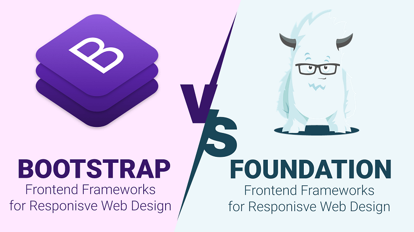
When it comes to being a developer and designer you usually always reach a crossroads of which CSS framework should you use? There are so many Front-end frameworks, but two of the most commonly mentioned ones are Bootstrap and Foundation.
Here is a comparison between Bootstrap and Foundation:
| Parameters | Bootstrap | Foundation |
|---|---|---|
| Current Version | V 4.0 alpha 6 | V 6.4 |
| Preprocessors | Less & Sass | Sass |
| Grid system | Flexbox-based | Floated (flexbox in latest version) |
| Customization | Basic GUI customizer | Basic GUI customizer |
| Community | 112k + (stars on Github) | 25.8k + (stars on Github) |
| Browser support | Chrome (Mac, Windows, iOS, and Android), Safari (Mac and iOS only), Firefox (Mac and Windows), Opera (Mac and Windows) IE9+ | Chrome (Mac, Windows, iOS, and Android), Safari (Mac and iOS only), Firefox (Mac and Windows), Opera (Mac and Windows), IE9+ |
| Design | Customizable; a variety of designs. | Not that appealing |
| Normalization/ Reset | reboot.css | normalize.css |
| Inline forms | Yes | No |
| License | MIT | MIT |
| Website | getbootstrap.com | get.foundation |
Front-end Frameworks List: If you want to explore more responsive Front-end Frameworks for your upcoming projects than you can Visit Here.
Conclusion: In order to make a conclusion which framework is better, you have to decide which one suits your requirements. In order to decide you must go through the features that each has to offer. With the given features currently listed, you must overlook that Foundation is quickly evolving and new updates are released frequently. Simply put, Foundation offers a slightly more complex, but a do it yourself style approach that will create something more unique and custom. Whereas Bootstrap allows for easy creation of simple yet elegant websites, with very little knowledge of CSS and JavaScript. Any CSS framework you chose will drastically simplify the web development process and provide the necessary foundations to build an amazing website.
If you found this article helpful, we encourage you to share it on your social media platforms—because sharing is caring! For more information about article submissions on our website, feel free to reach out to us via email.
Send an emailWritten by RGB Web Tech
Latest Technology Trends
Latest technology trends shaping the future, including AI advancements, blockchain innovation, 5G connectivity, IoT integration, and sustainable tech solutions. Explore breakthroughs in quantum computing, cybersecurity, augmented reality, and edge computing. Stay ahead with insights into transformative technologies driving innovation across industries and revolutionizing how we live, work, and connect.
What is the best CSS Framework
Last updated on April 20, 2026 by RGB Web Tech
When it comes to being a developer and designer you usually always reach a crossroads of which CSS framework should you use? There are many out there to choose from, but two of the most commonly mentioned ones are Bootstrap and Foundation. In this post, we will be comparing the two CSS frameworks, Bootstrap vs Foundation. Read more below about how using a framework can help speed up and streamline your development and design process.
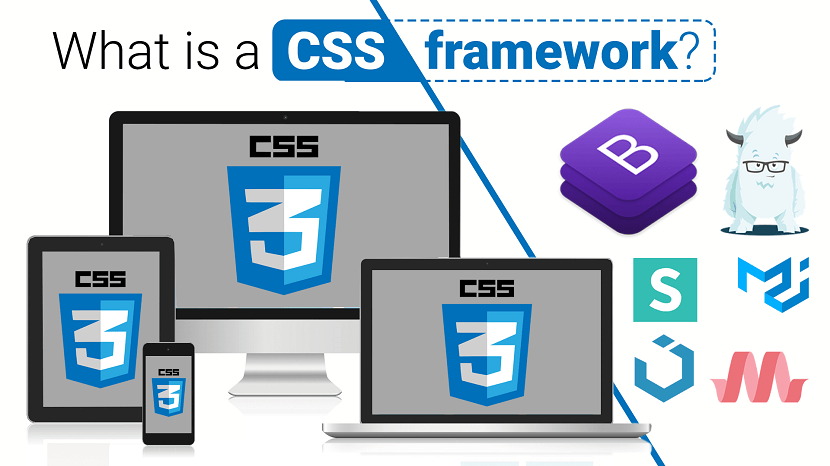
What is a CSS framework?
Building a website or app from scratch can take a lot of time and development. A CSS framework is commonly used by developers and designers as a tool to speed up the process. A CSS framework, also sometimes referred to as a frontend framework, is essentially a package that is made up of predefined HTML, CSS, and JS which can be used when starting to build out a project. This way you don't have to code from a blank slate every time you need to create a website or web application. In this post, we are specifically focusing on frontend frameworks which usually have to deal with what the visitor actually sees.
A CSS framework usually consists of the following components:
- HTML code which helps make up the structure of the pages.
- Typography styles.
- CSS to visually change how elements appear (a standard set of easy to use classes).
- JavaScript to change dynamic elements such as drop downs, expanding menus, etc.
- Responsive media queries.
- Cross-browser compatibility fixes.
Front-end Frameworks List: If you want to explore more responsive Front-end Frameworks for your upcoming projects than you can Visit Here.
If you found this article helpful, we encourage you to share it on your social media platforms—because sharing is caring! For more information about article submissions on our website, feel free to reach out to us via email.
Send an emailWritten by RGB Web Tech
Latest Technology Trends
Latest technology trends shaping the future, including AI advancements, blockchain innovation, 5G connectivity, IoT integration, and sustainable tech solutions. Explore breakthroughs in quantum computing, cybersecurity, augmented reality, and edge computing. Stay ahead with insights into transformative technologies driving innovation across industries and revolutionizing how we live, work, and connect.
Advantages and Disadvantages of Front-End Frameworks
Last updated on April 20, 2026 by RGB Web Tech
As developers, we often find ourselves looking for ways to be more efficient. For many of us, this means turning to front-end frameworks. Whether it is robust, full-featured frameworks like Bootstrap or Foundation or more foundational frameworks such as Skeleton or Pure, developers are turning to these tools to get a jumpstart on web projects.
Advantages of Using a Front-end Framework
First, let’s take a look at a few Advantages of using a front-end framework.
- Easy and quick to get started.
- They are great for prototyping.
- You can gain momentum by “getting something on the page”.
- They are handy when you are against tight deadlines.
- They provide a solid foundation for responsive design.
- Components of the UI have a base style to be extended (forms, buttons, navbar, etc.)
- The base styles persist throughout.
- They provide a consistent UI design for developers who lack design skills, which is great for things like intranet sites or documentation.
- They provide a base development for non-developers to get something up quick for prototyping or mockups.
Good looking UI, even out-of-the-box
- Components of the UI have a base style to be extended (forms, buttons, menus, etc.)
- The base styles persist throughout.
- They provide a consistent UI design for developers who lack design skills, which is great for things like intranet sites or documentation.
- They provide a base development for non-developers to get something up quick for prototyping or mockups.
Code is reliable and tested
- Code is widely used, especially open source.
- Cross-browser compatibility is built-in, so you know where it will work.
Help is readily available
- Front-end frameworks are widely used, so answers to common problems are easy to find.
- The documentation is usually thorough.
- Free and professional themes and templates may be available.
Disadvantages of Using a Front-end Framework
While development frameworks have been gaining in popularity over the past few years, not all frameworks are created equal and often a front-end framework is not the right tool for the job. Here are a few disadvantages I have found to using them:
They can be too opinionated
Although they are easy to get started, they can require more time down the road to add features and customizations. You might find yourself fighting the base styles with overrides (wasting all that precious time you saved) to get the desired results. This can also lead you to write code that does not evolve gracefully as the project needs change.
Note: Some of these risks can be mitigated by selecting a framework which is more flexible or closely resembles your project. I would advise testing out different frameworks, so you have a better understanding of the advantages and limitations of these tools when a new project comes along.
You’re not learning how to code
It is easy to fall into the trap of only learning the framework and not learning how to develop. You often miss out on valuable experience with the underlying technology. If you are not already an expert, it is important to understand the code which powers the framework. This knowledge will make life a lot easier when you run into complex challenges and will make you a better developer overall.
Updates can introduce issues
- Updating may introduce conflicts with your code.
- When it comes to updates, at the mercy of the framework developers. Sure, you can choose not to update, but you then risk falling behind.
Technical debt
- Developers coming onto the project will need to understand the framework in order to contribute.
- “One-size-fits-all” frameworks tend to have a larger footprint and can add unnecessary bloat to your project.
Front-end Frameworks List: If you want to explore more responsive Front-end Frameworks for your upcoming projects than you can Visit Here.
Conclusion: As with most development decisions, the choice to use a framework and which framework to use should be made based on the requirements of a specific project. What may be perfect for a small marketing website, may not be so great for building a highly-customized web portal. With new frameworks popping up frequently, but as developers, it’s still important to be diligent in selecting frameworks that suit our needs and the needs of our clients.
If you found this article helpful, we encourage you to share it on your social media platforms—because sharing is caring! For more information about article submissions on our website, feel free to reach out to us via email.
Send an emailWritten by RGB Web Tech
Latest Technology Trends
Latest technology trends shaping the future, including AI advancements, blockchain innovation, 5G connectivity, IoT integration, and sustainable tech solutions. Explore breakthroughs in quantum computing, cybersecurity, augmented reality, and edge computing. Stay ahead with insights into transformative technologies driving innovation across industries and revolutionizing how we live, work, and connect.