Bootstrap is a free and open-source CSS framework directed at responsive, mobile-first front-end web development. It contains CSS- and (optionally) JavaScript-based design templates for typography, forms, buttons, navigation, and other interface components.
Highlights:
- Author: Mark Otto, Jacob Thornton
- Developer's: Bootstrap Core Team
- Initial release: August 19, 2011
- Written in: HTML, CSS, Less (v3), Sass (v4) and JavaScript
- Platform: Web platform
- Open-source: Yes
- Website: https://getbootstrap.com
- Alexa Rank: 2,108
Bootstrap 4 Alpha 6 Features:
1. Rewritten grid system in flexbox: They improved the grid system with three major changes. Here, one can disable the grid classes by the SASS variable. You can add a grid customization section to the documents. You will see also witness simplified grid classes. These changes are available in both standard and flexbox grids.
2. Flexbox by default: Along with flexbox being the default system. There are flexbox grids, also available, apart from standard ones. And new flexbox alignment utility classes at hand for distributing items as well.
3. IE9 support: Bootstrap CSS has released this long-awaited update of IE9 support.
4. Forms: With development to Alpha 4, there are significant changes in forms. There are necessary improvements in sizing, alignment, and component layout. The ‘fresh form validation and help text options are ready. And the documentation for forms is simplified too.
5. Automatic equal-width grid columns: Breakpoint-specific column classes can be employed for columns with equal width.
6. Updated and improved Navbar: Earlier there were certain styles for nav components that could not be set by variables. This update takes care of that and also adds some new features to it.
7. Auto margins for easy spacing: They improved the auto margins for easy spacing.
8. Change in system fonts: Helvetica/Arial font was old system fonts. They are replaced with a system font stack of modern, and strong fonts. This is done for companies like Apple, Google, Mac, to target the latest devices. Although, there is no such update available for Linux users.
Pros:
- Massive community support.
- Widest variety of themes.
- Best browser capability.
- Has both a fluid and fixed pattern grid system.
- More development tools available.
- Many popular websites are built on this framework.
- Superiority in mobile support.
- Most of the celebrated custom web development companies prefer this tool.
Cons:
- Not as lightweight when compared to others. Out-of-the-box file size of 276 KB due to an excessive number of rarely used styles.
- Difficult to use jQuery plugins.
- Websites are easily recognizable.
- The excessive number of HTML classes and DOM elements can be messy and confusing
Popular Brands Using Bootstrap:
- Lyft
- Vogue
- Riot Design
- Newsweek
Ideal for: Beginners and those who prefer a robust front-end framework.
Bootstrap Alternatives: If you want to explore more responsive Front-end Frameworks for your upcoming projects than you can Visit Here.
Bootstrap Alternatives: If you want to explore bootstrap alternatives. Visit Here
Bootstrap, originally named Twitter Blueprint, was developed by Mark Otto and Jacob Thornton at Twitter as a framework to encourage consistency across internal tools. Before Bootstrap, various libraries were used for interface development, which led to inconsistencies and a high maintenance burden.
After a few months of development by a small group, many developers at Twitter began to contribute to the project as a part of Hack Week, a hackathon-style week for the Twitter development team. It was renamed from Twitter Blueprint to Bootstrap and released as an open-source project on August 19, 2011. It has continued to be maintained by Mark Otto, Jacob Thornton, and a small group of core developers, as well as a large community of contributors.
Bootstrap 2
On January 31, 2012, Bootstrap 2 was released, which added built-in support for Glyphicons, several new components, as well as changes to many of the existing components. This version supports responsive web design, meaning the layout of web pages adjusts dynamically, taking into account the characteristics of the device used (whether desktop, tablet, or mobile phone).
Bootstrap 3
The next major version, Bootstrap 3, was released on August 19, 2013. It redesigned components to use flat design and a mobile-first approach.
Bootstrap 4
Mark Otto announced Bootstrap 4 on October 29, 2014. The first alpha version of Bootstrap 4 was released on August 19, 2015. The first beta version was released on 10 August 2017. Mark suspended work on Bootstrap 3 on September 6, 2016, to free up time to work on Bootstrap 4. Bootstrap 4 was finalized on January 18, 2018.
Significant changes include:
- Major rewrite of the code.
- Replacing Less with Sass.
- Addition of Reboot, a collection of element-specific CSS changes in a single file, based on Normalize.
- Dropping support for IE8, IE9,[contradictory] and iOS 6.
- CSS Flexible Box support.
- Adding navigation customization options.
- Adding responsive spacing and sizing utilities.
- Switching from the pixels unit in CSS to root ems.
- Increasing global font size from 14px to 16px.
- Dropping the panel, thumbnail, pager, and well components.
- Dropping the Glyphicons icon font.
- Huge number[quantify] of utility classes.
- Improved form styling, buttons, drop-down menus, media objects, and image classes.
- Bootstrap 4 supports the latest versions of Google Chrome, Firefox, Internet Explorer, Opera, and Safari (except on Windows). It additionally supports back to IE9 [contradictory] and the latest Firefox Extended Support Release (ESR).
Bootstrap 5
Bootstrap 5 is a updated version of bootstrap4 and Bootstrap 5 alpha was officially released on June 16, 2020 after several months of refining. With all of the major changes in this version, the Boostrap 5 development team informed the users that the current version is still in alpha version thus, breaking changes will continue to occur until the first beta is released so it’s better to always check the open issues and pull requests on their official GitHub repository for open questions and feedback.
Summary of the most important changes:
- jQuery was removed
- Switch to Vanilla JavaScript
- Drop Internet Explorer 10 and 11 support
- Improved grid system
- Improved documentation
- Improved modularity
- Improved forms
- New responsive font
- New utilities & helpers
- Easier customization & theming
- Lighter package
- New API available
Bootstrap Alternatives: If you want to explore more responsive Front-end Frameworks for your upcoming projects than you can Visit Here.
If you found this article helpful, we encourage you to share it on your social media platforms—because sharing is caring! For more information about article submissions on our website, feel free to reach out to us via email.
Send an email
Written by RGB Web Tech
Latest Technology Trends
Latest technology trends shaping the future, including AI advancements, blockchain innovation, 5G connectivity, IoT integration, and sustainable tech solutions. Explore breakthroughs in quantum computing, cybersecurity, augmented reality, and edge computing. Stay ahead with insights into transformative technologies driving innovation across industries and revolutionizing how we live, work, and connect.
Related Articles - Website Design
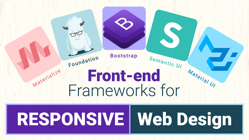
Front-end Frameworks for Responsive Web Design
Is CSS taking up a lot of time? Learn the benefits of CSS frameworks to get your website built faster than ever!
Bootstrap Front-end Frameworks for Responsive Web Design
Bootstrap is an intuitive and powerful front-end framework for developing responsive, mobile first projects on the web.
Foundation Front-end Frameworks for Responsive Web Design
Foundation is a CSS framework designed by ZURB in September 2011. It has responsive grid ( HTML & CSS) UI components, templates, and code snippets ...
Bootstrap V/S Foundation Comparison
When it comes to being a developer and designer you usually always reach a crossroads of which CSS framework should you use?
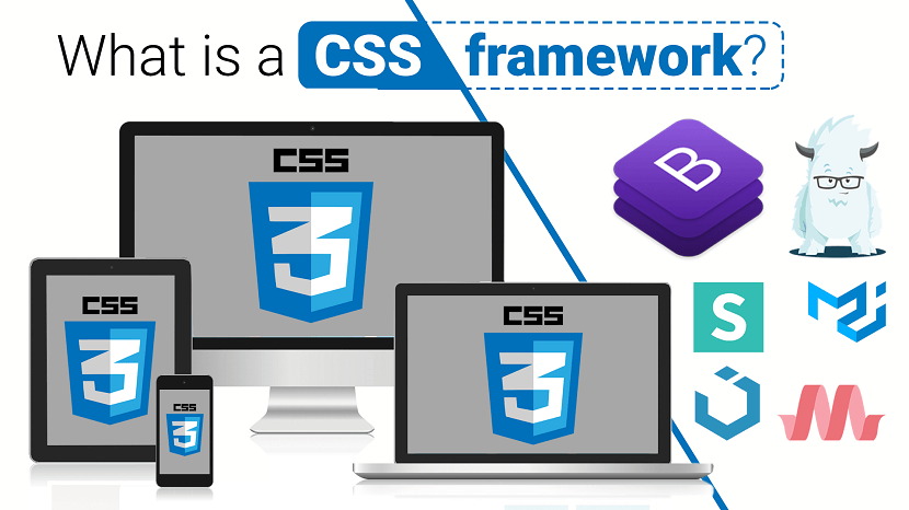
What is a CSS framework
When it comes to being a developer and designer you usually always reach a crossroads of which CSS framework should you use?
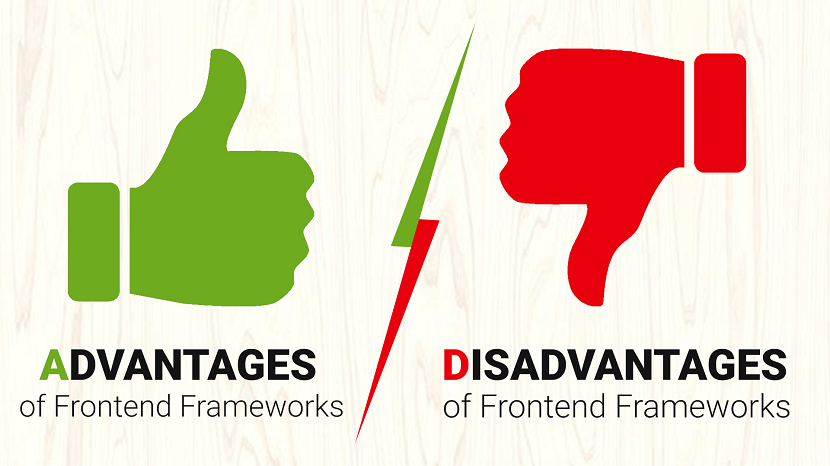
Advantages and Disadvantages of Front-end Frameworks
As developers, we often find ourselves looking for ways to be more efficient. For many of us, this means turning to front-end frameworks.
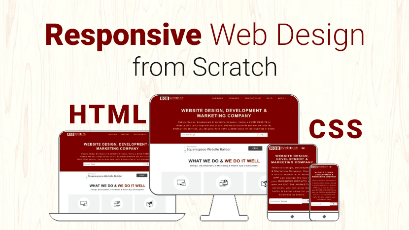
How to Make a Responsive Website from scratch
You can create custom responsive designs using just HTML and CSS only. Some of the great responsive email templates are designed...
NoteTab HTML Editor
NoteTab is a freeware/commercial, multi-file, full-screen text editor for MS Windows. It was developed by Eric Fookes of Fookes Software, Switzerland.
Bluefish HTML Editor
Bluefish is a powerful editor targeted towards programmers and web developers, with many options to write websites, scripts and programming code.
CotEditor HTML Editor
CotEditor, designed for macOS, offers seamless functionality, quick launch, and a native feel, letting you start writing instantly.
Aptana Studio HTML Editor
Aptana Studio is an open-source integrated development environment (IDE) for building web applications. Based on Eclipse, it supports JavaScript, HTML ...
Setka WYSIWYG Editor
Setka Editor is a content editing platform with a no-code WYSIWYG editor and a channel-agnostic framework. This allows remote teams of any size ...
TextMate HTML Editor
TextMate for Mac brings Apple's approach to operating systems into the world of text editors. By bridging UNIX underpinnings and GUI, ...
BareBonesEdit HTML Editor
Bare Bones Software is a private North Chelmsford, Massachusetts, United States software company developing software tools for the Apple Macintosh ...
UltraEdit HTML Editor
UltraEdit is a commercial text editor for Microsoft Windows, Linux and OS X created in 1994 by the founder of IDM Computer Solutions Inc., Ian D. Mead.
Kompozer WYSIWYG Editor
KompoZer is a discontinued open source WYSIWYG HTML editor based on the Nvu editor, which was itself derived from the composer component of ...
Phase 5 HTML Editor
Phase 5 is an impressive German HTML editor. It is freeware but only for Schools and Home users. It support different languages such as HTML, PHP, Java..

Editor.js WYSIWYG Editor
Editor.js is an open-source editor. It allows you to edit blocks of content that you can move around and reorder.
CoffeeCup HTML Editor
CoffeeCup is a powerful Form Builder for advanced users, with many premium features that will boost your marketing campaigns with plenty of leads
Brackets HTML Editor
Brackets is a source code editor with a primary focus on web development. Created by Adobe Systems, it is free and open-source software.
Froala WYSIWYG Editor
Froala is a lightweight, JavaScript-based WYSIWYG HTML editor with rich text features, rapid extensions, and a clean, user-friendly design.
Komodo Edit HTML Editor
It is a free and fast HTML editor for numerous platforms such as macOS X, Windows, and Linux. It supports multiple languages such as HTML5, PHP, Perl etc.
NetBeans HTML Editor
NetBeans is an integrated development environment (IDE) for Java. NetBeans allows applications to be developed from a set of modular software components
TinyMCE WYSIWYG Editor
TinyMCE is the rich text editor, the goal of TinyMCE is to help other developers build beautiful web content solutions.
CKEditor WYSIWYG Editor
CKEditor 4 is a browser-based rich text editor with a plugin-based architecture, enabling seamless content processing and easy customization.
Atom HTML Editor
Atom is a free, open-source code editor developed by GitHub, offering a customizable environment with a free software license for its packages.
Sublime Text HTML Editor
Sublime is another excellent free HTML editor. Freemium means that you can use Sublime for free, but you have to buy a license to enjoy the full features.
Bubble WYSIWYG Editor
Bubble is ideal for creating and launching fully-functional web applications in a fraction of the time it would take to build them from scratch.
Notepad++ HTML Editor
Notepad++ is a free HTML editor that was developed for Windows-based machines. This editor is distributed as free software and its repository is also ...
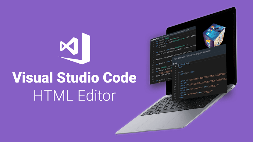
Visual Studio Code HTML Editor
Visual Studio Code is one of the most popular and powerful text editors used by software engineers today.
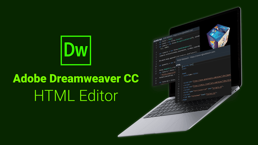
Adobe Dreamweaver CC HTML Editor
Learn about Adobe Dreamweaver and 5 reasons to start using this powerful software tool to quickly build websites and web applications.
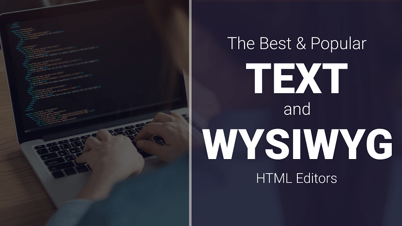
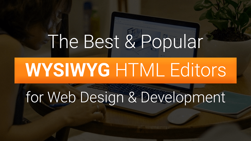
HTML Editors and WYSIWYG Editors for Web Design and Development
Want to write clean code faster? An HTML and CSS code editor can help. Discover the perks of having a code editor and see the top options for this year.
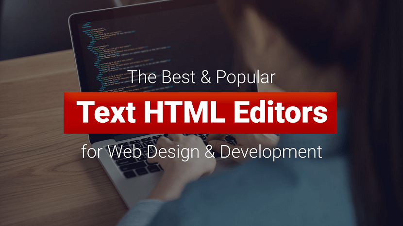
Best HTML Editors
HTML editor is a tool that helps you to edit and create HTML code. It is a text-based tool which lets you edit your source code directly.
Best WYSIWYG HTML Editors
Best HTML WYSIWYG Editor from our top picks based on features you need for creating or enhancing your website.
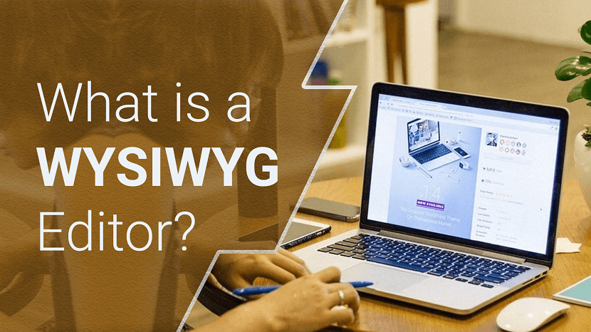
What is a WYSIWYG Editor
WYSIWYG stands forWYSIWYG stands for - What You See is What You Get. When an HTML editor is in WYSIWYG mode, the HTML page is rendered ...
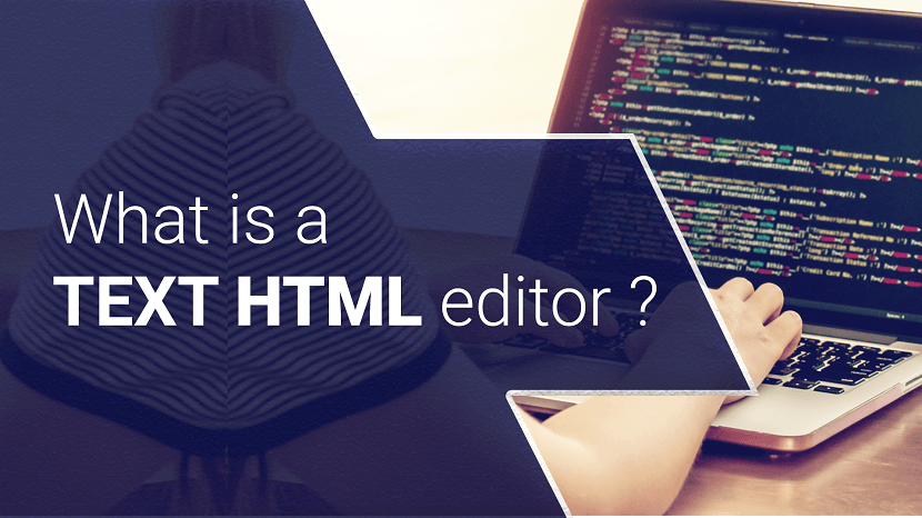
What is a Textual HTML editor
As the name implies, textual HTML editors are text-based. You should have HTML knowledge when using these types of editors.
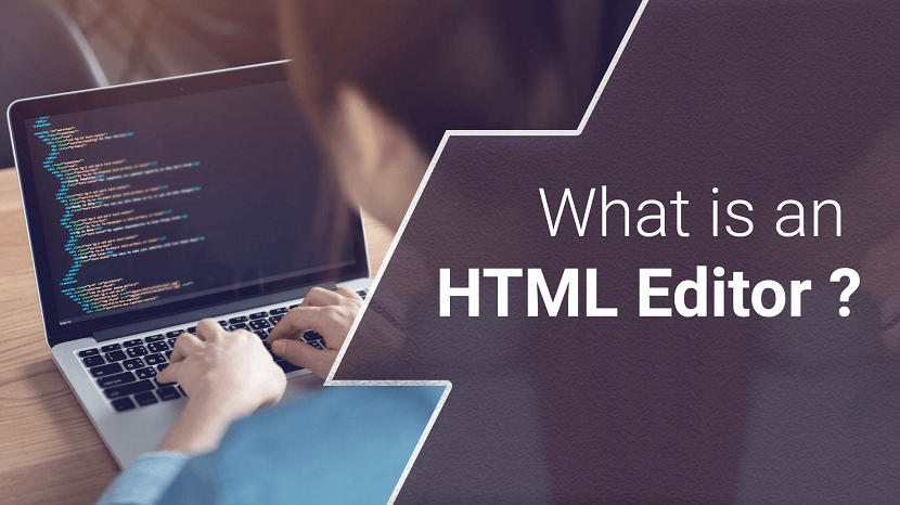
What is an HTML Editor
The very fundamentals of HTML editors are the same, they help you write code by highlighting syntaxes, insert commonly used HTML elements and structures
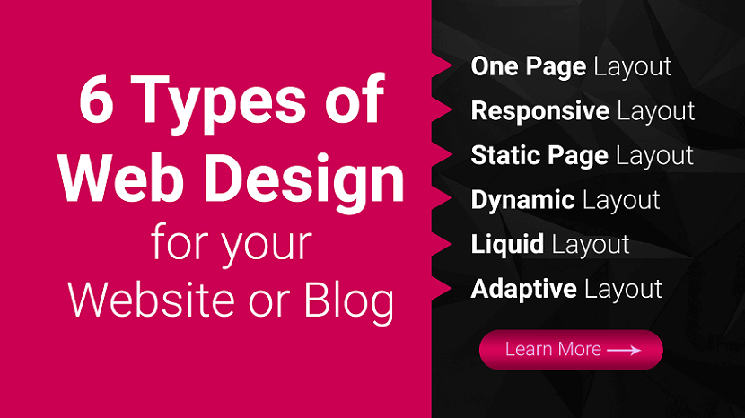
Types of Website Design
Ready to build your website but are not sure which web design format is best? Here are six of the most common web design layouts for your business.
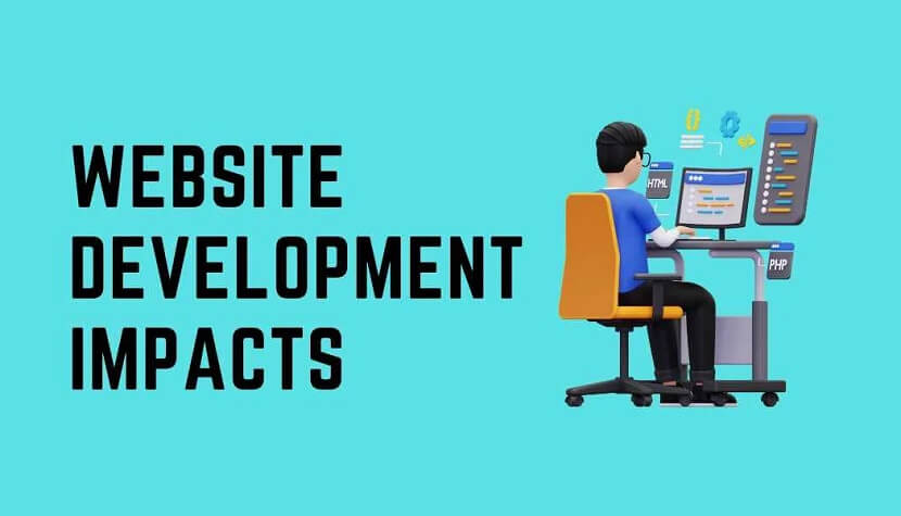
How Web Design and Development Impact Your Online Presence
Discover the power of web design and development in shaping your online presence. Create captivating user experiences and drive success.

Optimizing Web Design for Slow Connections
Optimize web design for slow connections with lightweight images, minimal scripts, and efficient coding for a seamless user experience.

User Interface Design Tips for Better User Experience
Enhance UX with practical UI design tips: focus on simplicity, consistency, intuitive navigation, responsive layouts, and user feedback.

Best Website Builders for Blogs in 2025: Create a Blog Quickly and Easily
Top 5 blog website builders for 2025, including beginner-friendly solutions like Site.pro — perfect for both newcomers and professionals.
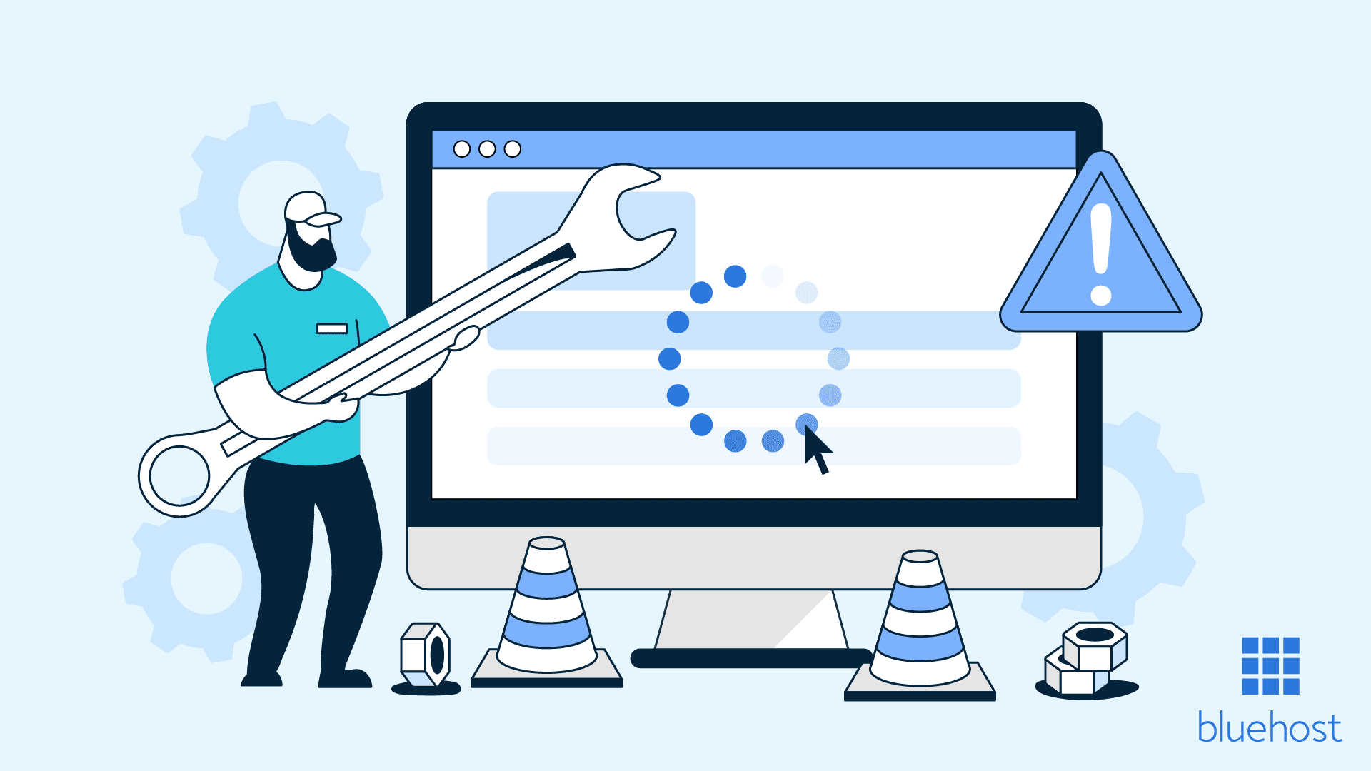
What to Do if Your Website Has Had Problems
Is your website not working properly? Learn what to do if your website has problems — from slow loading and broken links to SEO errors. Discover proven tips to fix website issues fast and improve performance.