With 94% of first impressions relying on website design, you must create a beautifully crafted website for your business or blog. But when you get started with web design service or looking for a web design package, you may not know what approach to take with your website. What types of web design are best for your business or blog?
Luckily for you, we have got all the answers. Keep reading to learn about six types of web design and the pros and cons of each:
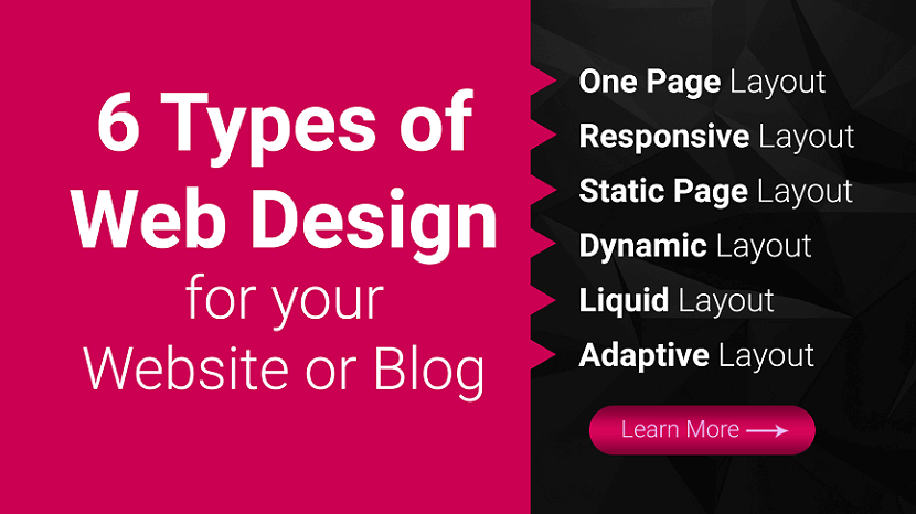
- One Page Website
- Responsive Website
- Static Website
- Dynamic Layout
- Liquid Website
- Adaptive Website
Plus, we will cover the different types of websites you can create, so you can determine which one is best for your business! Need some marketing inspiration?
Subscribe to our email newsletter for more updates!
6 Types of Web Design for your Website or Blog
Ready to build your website but are not sure which web design format is best? Here are six of the most common web design layouts for your business and the pros and cons of each.
1. One Page Website
We will cover on our list of types of web design as a one page layout website. As the name implies, a one page layout website uses only a single page that users scroll down to find information about your products or services. With this design layout, you can have a “Navigation Menu” with links to specific points of your page.
Pros of Single Page Website:
- Easy to create.
- Can help you create a clean and simple website.
Cons of Single Page Website:
- Can not be used for businesses that sell products online.
- Can not be used for companies that need multiple pages.
- Can deter people away if the single page is too long and requires too much scrolling.
2. Responsive Website
Next on our list of types of website layouts is responsive design layout website. This layout format is the most popular type, as it allows your site to accommodate all devices and fill the browser size perfectly. Responsive design is built with a mobile first approach.
You create your mobile layout first, and then you expand your website for bigger browser sizes. So instead of trying to trim down your website and make it smaller, you start small and build it bigger.
Pros of Responsive Website:
- Get a website that’s built for mobile users.
- Delivers a seamless experience on all devices.
- Do not have to build a separate mobile site.
Cons of Responsive Website:
- Takes more time to build and develop.
3. Static Website
Most basic type of website design is a static page layout website. With this layout, you build a website with pre-set page dimensions. It has a permanent width. Static layouts stick to these dimensions, regardless of the browser or device type.
Static layouts have phased out with the rise of mobile usage. Since these sites do not adapt to devices, they do not provide a positive user experience on smartphones or tablets. While static layouts are still an option, you typically do not want to use them unless you are creating a completely separate mobile version of your site.
Pros of Static Website:
- Easy to set up.
Cons of Static Website:
- Not responsive to devices or browsers.
- Requires creating a separate mobile site (more work).
4. Dynamic Website
When you look at a list of the types of web design, you will see that the dynamic website layout is an option. Dynamic website layouts are great for people who do not have extensive HTML knowledge. These websites can deliver different content to website visitors, even if two separate people look at the same page.
With a dynamic website vs. static website, you build a database of information and features. Then, when a user requests a page, the web coding automatically works to put the components together from your database to form the webpage.
Pros of Dynamic Website:
- Interactivity with users.
- Increased functionality for users.
- Less coding skills required.
Cons of dynamic Website:
- Can be more complex to set up with different functionalities.
- Tend to load slower because of all the different elements and page compositions.
5. Liquid Website
Next on this list of types of website design is liquid design layout website. This layout, also known as Fluid Design, uses flexible units rather than the fixed units static layouts use. Since the units are flexible, the page will always fill the width with the device’s screen, regardless of what device it is.
Because user experience is critical to your site driving and engaging traffic, liquid layouts have also started to phase out as a viable option for businesses. While you can still use this layout, you risk delivering a poor user experience from your site stretching too far or squishing information together on the page.
Pros of Liquid Website:
- Easier to set up than responsive design
- No information gets cut off on pages
Cons of Liquid Website:
- If a browser is really wide, information gets stretched to fit the screen and can look unappealing
- If a browser is smaller, information gets smooshed together to fit the screen, making it difficult to read and browse
6. Adaptive Website
One web design format you can use for your site is adaptive website layout. As the name implies, this website uses CSS queries to adjust the website’s size to detect the size of the browser. Adaptive websites will automatically alter the website’s layout to provide the best user experience for visitors.
With adaptive website layouts, there are set parameters for how a website will adjust. For example, a set parameter may look like this: “If the browser is 500 pixels wide, set the main content container for 400 pixels wide.” For example, if you have a website with a two-column layout, the adaptive layout would change into a single-column design on a small browser screen.
Pros of Adaptive Website:
- Easy to set up.
- Takes less development time than responsive layouts.
- Can adjust your website according to each browser size.
Cons of Adaptive Website:
- Device widths in between set points can cause your site to have too much space or not enough space.
- Is not fully responsive.
Types of website layouts
Here is a list of different website layouts and which sites benefit the most from them:
1. F-shape layout
The f-shape layout creates a website design that follows the general viewing pattern of the site's visitors. Scientific studies have found that website users often view and move their eyes across a web page creating an F or E shape. Webpages that design their layout to match those instinctive eye movements can help capture visitors' attention more naturally. These types of layouts are most common for websites that display a lot of options for users to choose from, such as news websites and search engines, allowing users to scan the options quickly and make a decision.
2. Z-shape layout
The z-shape layout is very similar to the f-shape layout, except it targets a different group of individuals. Scientific studies have shown that individuals from western cultures use a z shape with their eyes more often than an f shape to navigate the pages of different websites. Z-shape layouts are often most effective for websites that have a singular goal, such as having consumers sign up for a service or purchase a product. Creating a button that navigates users to the next step of company interaction and placing it along the z-shape path can help increase customer outreach and revenue.
3. Grid of cards layout
A grid of cards layout displays information in a grid system that users or website visitors can easily manipulate by adjusting the size of the browser window or screen. Some of the most common sites that use a grid of cards layout are video streaming websites that display image previews for their different video options. They display each of the previews as cards in a grid system, and the number of visible video options changes based on the size of the screen.
A grid layout is great for websites, like video streaming services, that display a lot of options and information of equal value, which can help users find what they're looking for more easily.
4. Boxes layout
The boxes layout uses one larger box as a website's header, which displays an image and two smaller boxes underneath that provide additional images or information for users. Each box gives the user important or engaging information about the company's or website's purpose and links the user to other dynamic web pages they can explore to find more helpful information. Because the boxes can prominently display images, artists often use this layout to show their portfolio and businesses use it to display featured products.
5. Split screen layout
A split screen layout divides a website into two sections that users can choose to explore. This layout works well for companies and organizations that have two pieces of content that are equally important to their business and consumers. For example, a clothing company that sells women's and men's clothing might use the split screen layout to advertise their products. Having both options on the front webpage can allow users to pick which one they're looking for quickly and continue exploring the site.
6. Fixed sidebar layout
The fixed sidebar layout places a stationary menu of options for users on the left or right side of the webpage. This sidebar menu provides visitors with quick and helpful navigation choices, allowing them to explore the website more easily. The fixed sidebar layout often works best with websites that have a limited number of webpages to choose from, such as businesses that sell one major product. For example, if a company that sold watches used a fixed sidebar, some of their menu options could include: about us, online store and contact us.
7. Magazine layout
The magazine layout uses a design that resembles printed publications. This design displays a lot of information to visitors by using a system of columns and grids to help individuals navigate the webpage more easily. The magazine layout is often used by publication companies to resemble how their product might look in its printed form, which can help create a fun and engaging format for users, motivating them to continue reading and exploring.
8. Asymmetrical layout
Asymmetrical layouts ensure that the webpage promotes an uneven design, meaning one half of the page is often larger than the other. Companies and organizations often use this layout to create an aesthetically pleasing web page while directing users to a certain area of the site.
For example, a business might use the larger section of the website to display an image or company slogan, while using the smaller side to encourage users to fill out their contact information to learn about special sales and promotions. The smaller section often attracts the visitor's attention, encouraging them to engage with the website or company. Because of its ability to entice users, the asymmetrical layout is often used on a website's homepage.
Featured image layout
The featured image layout places a prominent and large image at the top of the webpage to attract users. Most often, the featured image is a picture of a popular product that a company or business is selling. Companies that sell aesthetically pleasing products often use this type of layout to immediately attract visitors' attention and encourage them to make a purchase. For example, a company that sells computers might use a featured image layout to display their computers' design and style.
10. Curated visuals layout
The curated visuals layout uses illustrated images to promote a product or service. Companies and organizations often use this layout to display a certain emotion they want users to feel when they use the webpage. This type of advertising strategy can help consumers feel motivated to interact with the company and possibly purchase their goods and services. Most often, businesses or companies with a complicated service that's difficult to sell might use curated visuals to help ease the experience and relay necessary information to users.
Types of websites
4 Types of websites you can create
In addition to narrowing down your list of types of website layouts to the best one, you also must determine what kind of website you need to create for your business. Every business has different needs, which means your site type may differ from others.
Here are four types of websites you can create for your business:
1. Business websites
First on our list is the type of website you can create as a business website. A business website is a standard site. It contains information about your company and the services you offer. If you do not sell products online, you may also build a business site just to showcase what you offer.
These sites are simple and serve as a hub for people to learn about your business. You can use this website type if you are not selling products on your website. For a business website, you can use any of the types of web design listed above. You will want to choose the ones that help you deliver the best experience for your audience.
2. Blog
Second on our list is the type of website you can create as a blog. Blogs are websites that share helpful information with readers about topics in their industry. While a blog may not be your company’s primary website, you may consider creating a blog site if you are doing content marketing.
Content marketing is a crucial strategy for helping your business grow online and build trust with your audience. You may consider having a separate blog website, or integrating it into your core website to help you take advantage of the benefits of content marketing.
This website type can use any type of web design format, except for one page layout website.
The best types of web design layouts for this website type are adaptive and responsive.
3. Ecommerce websites
Another type of website you can create for your business is an ecommerce website. This website type is best for your business if you want to sell products on your site. Ecommerce sites are built to host product pages, add products to a cart, and complete transactions.
If you’re looking to sell products, this website type is best for your business.
In terms of the best types of web design for an ecommerce website, responsive and adaptive are most suitable for an ecommerce site.
4. Membership websites
The last type of website you can create is a membership website. With this website type, you have a paywall for people to enter. Only people who have a membership can enter your site and see your products.
A1truejobs.com is a membership website example. You must create an account and pay the membership fee and become a member of the site.
If you want to use this website type, you can use two types of web design layouts: adaptive or responsive.
Need help figuring out which type of web design is best for you?
With so many types of web design available, it’s challenging to know which type is best for your business. If you’re feeling overwhelmed with building the best website, RGB Web Tech can help you to create a beautiful web design for your business or blog.
Our team experts can help you craft a beautifully designed website that delivers the best experience for your audience. Ready to build your dream website? Contact us online or call us today at +91-9878585860 to speak with a strategist about our web design services and affordable web design packages
If you found this article helpful, we encourage you to share it on your social media platforms—because sharing is caring! For more information about article submissions on our website, feel free to reach out to us via email.
Send an email
Written by RGB Web Tech
Latest Technology Trends
Latest technology trends shaping the future, including AI advancements, blockchain innovation, 5G connectivity, IoT integration, and sustainable tech solutions. Explore breakthroughs in quantum computing, cybersecurity, augmented reality, and edge computing. Stay ahead with insights into transformative technologies driving innovation across industries and revolutionizing how we live, work, and connect.
Related Articles - Website Design
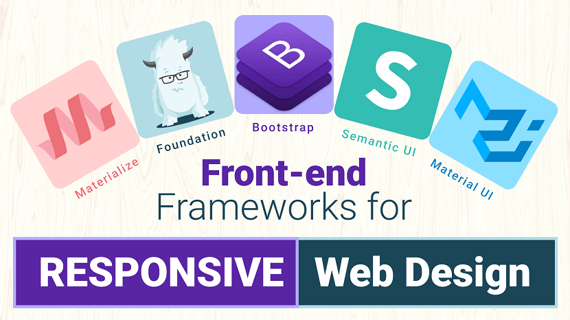
Front-end Frameworks for Responsive Web Design
Is CSS taking up a lot of time? Learn the benefits of CSS frameworks to get your website built faster than ever!
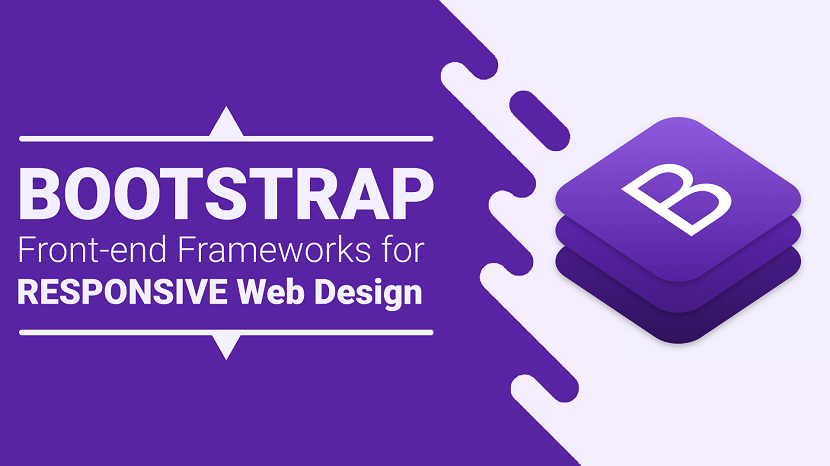
Bootstrap Front-end Frameworks for Responsive Web Design
Bootstrap is an intuitive and powerful front-end framework for developing responsive, mobile first projects on the web.
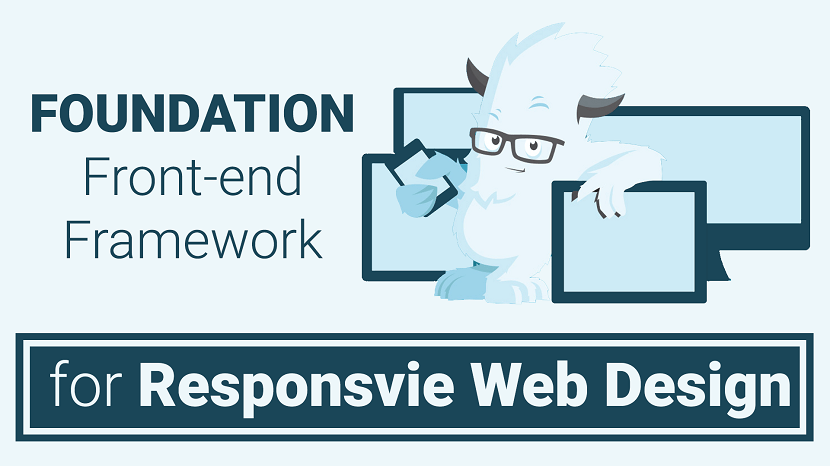
Foundation Front-end Frameworks for Responsive Web Design
Foundation is a CSS framework designed by ZURB in September 2011. It has responsive grid ( HTML & CSS) UI components, templates, and code snippets ...
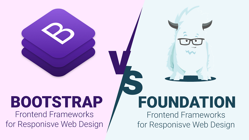
Bootstrap V/S Foundation Comparison
When it comes to being a developer and designer you usually always reach a crossroads of which CSS framework should you use?
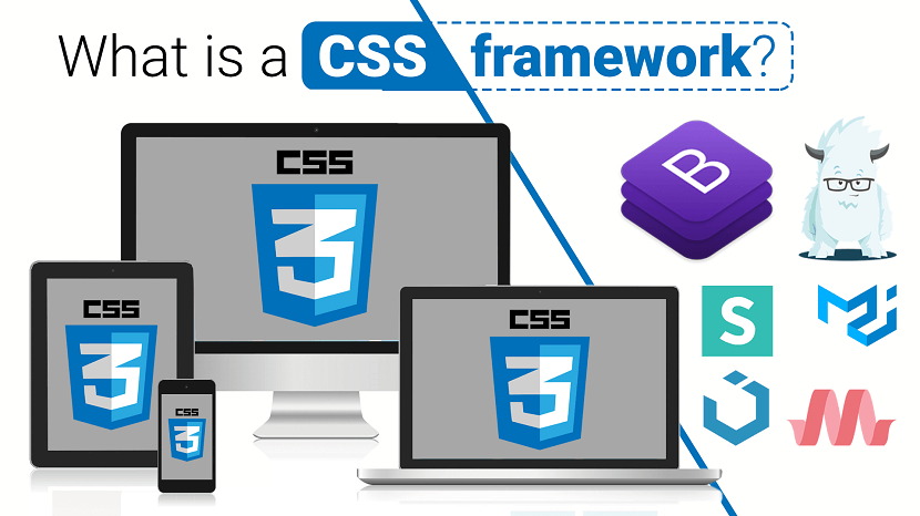
What is a CSS framework
When it comes to being a developer and designer you usually always reach a crossroads of which CSS framework should you use?
Advantages and Disadvantages of Front-end Frameworks
As developers, we often find ourselves looking for ways to be more efficient. For many of us, this means turning to front-end frameworks.
How to Make a Responsive Website from scratch
You can create custom responsive designs using just HTML and CSS only. Some of the great responsive email templates are designed...
NoteTab HTML Editor
NoteTab is a freeware/commercial, multi-file, full-screen text editor for MS Windows. It was developed by Eric Fookes of Fookes Software, Switzerland.
Bluefish HTML Editor
Bluefish is a powerful editor targeted towards programmers and web developers, with many options to write websites, scripts and programming code.
CotEditor HTML Editor
CotEditor, designed for macOS, offers seamless functionality, quick launch, and a native feel, letting you start writing instantly.
Aptana Studio HTML Editor
Aptana Studio is an open-source integrated development environment (IDE) for building web applications. Based on Eclipse, it supports JavaScript, HTML ...
Setka WYSIWYG Editor
Setka Editor is a content editing platform with a no-code WYSIWYG editor and a channel-agnostic framework. This allows remote teams of any size ...
TextMate HTML Editor
TextMate for Mac brings Apple's approach to operating systems into the world of text editors. By bridging UNIX underpinnings and GUI, ...
BareBonesEdit HTML Editor
Bare Bones Software is a private North Chelmsford, Massachusetts, United States software company developing software tools for the Apple Macintosh ...
UltraEdit HTML Editor
UltraEdit is a commercial text editor for Microsoft Windows, Linux and OS X created in 1994 by the founder of IDM Computer Solutions Inc., Ian D. Mead.
Kompozer WYSIWYG Editor
KompoZer is a discontinued open source WYSIWYG HTML editor based on the Nvu editor, which was itself derived from the composer component of ...
Phase 5 HTML Editor
Phase 5 is an impressive German HTML editor. It is freeware but only for Schools and Home users. It support different languages such as HTML, PHP, Java..

Editor.js WYSIWYG Editor
Editor.js is an open-source editor. It allows you to edit blocks of content that you can move around and reorder.
CoffeeCup HTML Editor
CoffeeCup is a powerful Form Builder for advanced users, with many premium features that will boost your marketing campaigns with plenty of leads
Brackets HTML Editor
Brackets is a source code editor with a primary focus on web development. Created by Adobe Systems, it is free and open-source software.
Froala WYSIWYG Editor
Froala is a lightweight, JavaScript-based WYSIWYG HTML editor with rich text features, rapid extensions, and a clean, user-friendly design.
Komodo Edit HTML Editor
It is a free and fast HTML editor for numerous platforms such as macOS X, Windows, and Linux. It supports multiple languages such as HTML5, PHP, Perl etc.
NetBeans HTML Editor
NetBeans is an integrated development environment (IDE) for Java. NetBeans allows applications to be developed from a set of modular software components
TinyMCE WYSIWYG Editor
TinyMCE is the rich text editor, the goal of TinyMCE is to help other developers build beautiful web content solutions.
CKEditor WYSIWYG Editor
CKEditor 4 is a browser-based rich text editor with a plugin-based architecture, enabling seamless content processing and easy customization.
Atom HTML Editor
Atom is a free, open-source code editor developed by GitHub, offering a customizable environment with a free software license for its packages.
Sublime Text HTML Editor
Sublime is another excellent free HTML editor. Freemium means that you can use Sublime for free, but you have to buy a license to enjoy the full features.
Bubble WYSIWYG Editor
Bubble is ideal for creating and launching fully-functional web applications in a fraction of the time it would take to build them from scratch.
Notepad++ HTML Editor
Notepad++ is a free HTML editor that was developed for Windows-based machines. This editor is distributed as free software and its repository is also ...
Visual Studio Code HTML Editor
Visual Studio Code is one of the most popular and powerful text editors used by software engineers today.
Adobe Dreamweaver CC HTML Editor
Learn about Adobe Dreamweaver and 5 reasons to start using this powerful software tool to quickly build websites and web applications.
HTML Editors and WYSIWYG Editors for Web Design and Development
Want to write clean code faster? An HTML and CSS code editor can help. Discover the perks of having a code editor and see the top options for this year.
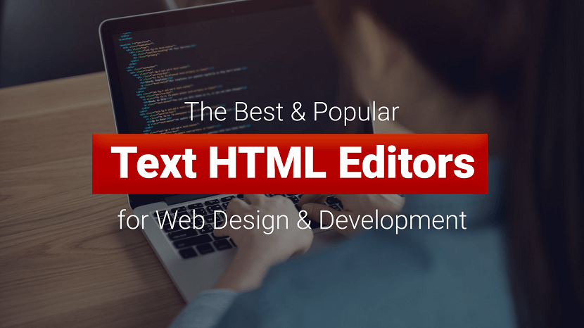
Best HTML Editors
HTML editor is a tool that helps you to edit and create HTML code. It is a text-based tool which lets you edit your source code directly.
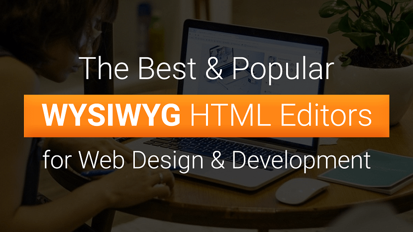
Best WYSIWYG HTML Editors
Best HTML WYSIWYG Editor from our top picks based on features you need for creating or enhancing your website.
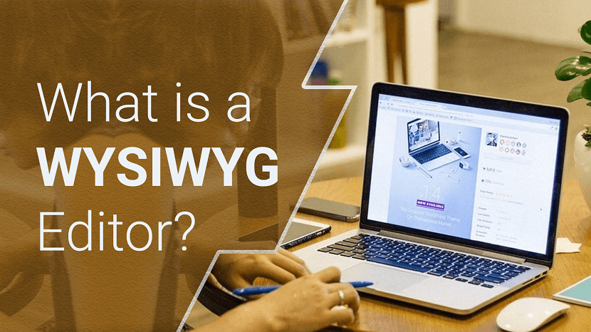
What is a WYSIWYG Editor
WYSIWYG stands forWYSIWYG stands for - What You See is What You Get. When an HTML editor is in WYSIWYG mode, the HTML page is rendered ...
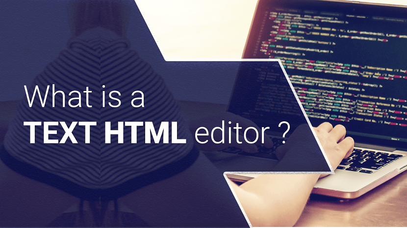
What is a Textual HTML editor
As the name implies, textual HTML editors are text-based. You should have HTML knowledge when using these types of editors.
What is an HTML Editor
The very fundamentals of HTML editors are the same, they help you write code by highlighting syntaxes, insert commonly used HTML elements and structures
Types of Website Design
Ready to build your website but are not sure which web design format is best? Here are six of the most common web design layouts for your business.
How Web Design and Development Impact Your Online Presence
Discover the power of web design and development in shaping your online presence. Create captivating user experiences and drive success.

Optimizing Web Design for Slow Connections
Optimize web design for slow connections with lightweight images, minimal scripts, and efficient coding for a seamless user experience.

User Interface Design Tips for Better User Experience
Enhance UX with practical UI design tips: focus on simplicity, consistency, intuitive navigation, responsive layouts, and user feedback.

Best Website Builders for Blogs in 2025: Create a Blog Quickly and Easily
Top 5 blog website builders for 2025, including beginner-friendly solutions like Site.pro — perfect for both newcomers and professionals.
What to Do if Your Website Has Had Problems
Is your website not working properly? Learn what to do if your website has problems — from slow loading and broken links to SEO errors. Discover proven tips to fix website issues fast and improve performance.