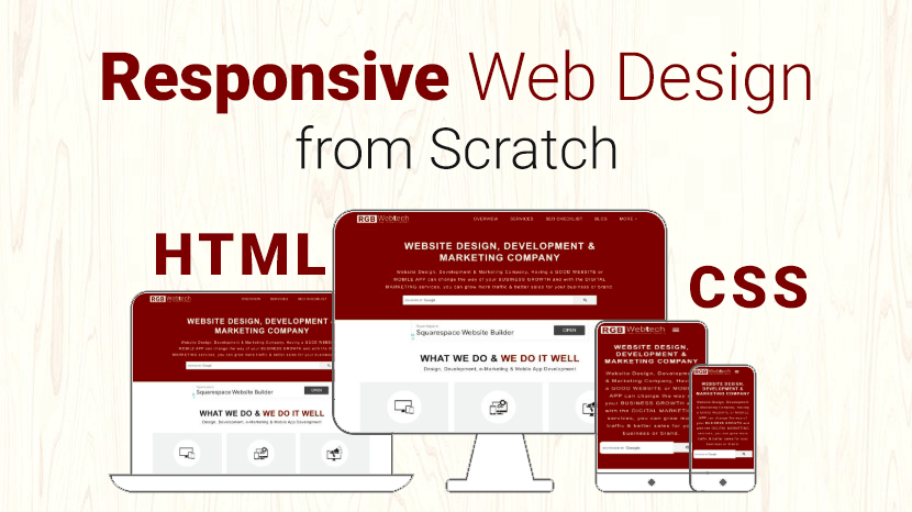
How to Build a Responsive Website from Scratch
Last updated on January 19, 2025 by RGB Web Tech
You can create custom responsive designs using just HTML and CSS only. Some of the great responsive email templates are designed in using just HTML and CSS because most of the email clients do not support Media Queries.
But you can’t make a complex custom responsive design by using HTML and CSS, for that purpose you need to use Media Queries and sometimes, even javascript
Today, a website must not look good only on a desktop screen, but also on tablets and smart phones.
A website is responsive if it can adapt to the screen of the client.
Responsive web design is extremely important nowadays and is one technique you need to master as a web designer.
In this article, I’ll show you how to easily build a custom responsive website and how to apply custom responsive design techniques on existing web pages in three easy steps.
Before you start a responsive design from scratch you need to keep some points in your mind as below:
1. Use meta tag in your website top of the header:
Viewpoint Meta Tag: Put viewport meta tag inside your page head area. This viewport tag will prevent the browser from zooming out the page. Thus it will remain the same width of the screen size.
Example:
2. Every code should be in % (percentage) instead of px (pixels).
Example:
3. Try to use flexbox layout as much as possible.
The Flexible Box Layout Module makes it easier to design a flexible responsive layout structure without using float or positioning.
Before the flexbox layout module, there were four layout modes:
- Block, for sections in a webpage.
- Inline, for text.
- Table, for two-dimensional table data.
- Positioned, for the explicit position of an element.
Example:
4. Beautify your design for tablets and smart phones screen by using media queries.
Now apply media queries in our CSS file, this is done with the help of condition statements. In the condition provide the min-width and max-width to target screen size.
Conclusion:
Hope you like this Responsive Website from scratch (HTML & CSS). I would also like to tell you that designing a responsive website from scratch can be a time-consuming job. There is also an easy alternative for responsive web design.
Alternatives of Responsive Web Design:
If you want to explore more responsive Front-end Frameworks for your upcoming projects than you can Visit Here.
If you found this article helpful, we encourage you to share it on your social media platforms—because sharing is caring! For more information about article submissions on our website, feel free to reach out to us via email.
Send an email
Written by RGB Web Tech
Latest Technology Trends
Latest technology trends shaping the future, including AI advancements, blockchain innovation, 5G connectivity, IoT integration, and sustainable tech solutions. Explore breakthroughs in quantum computing, cybersecurity, augmented reality, and edge computing. Stay ahead with insights into transformative technologies driving innovation across industries and revolutionizing how we live, work, and connect.
Unlocking Success: How Web Design and Development Impact Your Online Presence
Last updated on January 19, 2025 by RGB Web Tech

In the era of rapid digital advancements, establishing a formidable online footprint becomes imperative for the triumph of any business venture. A meticulously crafted and expertly engineered website can potentially wield a profound impact on the perception of your brand, ultimately ushering you toward the gateway of triumph. Within the confines of this article, we shall delve deep into the realm of web design and development, unraveling its intrinsic capabilities to instill a positive transformation in your virtual presence. Brace yourself as we commence this enthralling odyssey toward attaining boundless success!
The Power of First Impressions
In the realm of your website, initial impressions hold immense significance. Studies have revealed that mere seconds are all visitors take to shape their perception of your site. Hence, it becomes paramount to fashion a design that is visually enchanting and user-friendly, seizing your audience's attention right from the moment they land on your virtual domain.
An aesthetically captivating framework, complemented by alluring imagery and captivating content, possesses the power to leave an indelible mark on your visitors. It conveys a sense of professionalism, credibility, and reliability, all of which are pivotal elements in establishing a robust online presence.
Navigating the User Experience
The success of a website is intricately tied to the user experience (UX) it offers. The seamless flow of navigation, an intuitive interface, and flawless functionality collectively contribute to a positive user experience. It is imperative that visitors can effortlessly find the information they seek, devoid of any sense of confusion or frustration.
The user experience can be considerably improved by adding simple navigation menus, clear call-to-action buttons, and strategically arranged content. By placing utmost importance on user experience during web design and development, you can effectively captivate and retain your audience, minimize bounce rates, and maximize conversions.
Mobile Optimization: A Must-Have
In an era dominated by the ubiquity of smartphones and tablets, optimizing your website for mobile devices is not merely a choice—it has become an absolute necessity. Neglecting the necessity of mobile optimization can seriously harm your online presence because a substantial amount of internet traffic comes from mobile users.
Responsive web design ensures the seamless adaptation of your website to diverse screen sizes and resolutions. It guarantees a consistent and intuitive user experience across a myriad of devices, thereby empowering mobile users to navigate and engage with your digital domain effortlessly. By embracing the essence of mobile optimization, you can extend your reach to a broader audience while concurrently enhancing your search engine rankings.
Leveraging Social Media Integration
Social media has become an inseparable part of our daily lives in our modern interconnected world. Harnessing the power of social media integration in your web design and development endeavors can revolutionize your online presence.
By seamlessly integrating social sharing buttons on your website, you can actively encourage and empower visitors to effortlessly share your valuable content with their extensive networks. Furthermore, real-time social media feeds display allows you to showcase captivating updates and actively engage with your cherished audience. By forging a solid and seamless connection between your website and various social media platforms, you can expand your reach, nurture unwavering brand loyalty, and attract a fresh influx of new followers.
Consider using QR codes as a cutting-edge and creative strategy as well. By strategically incorporating QR codes into your web design, you can provide a quick and convenient way for users to access and share your website or specific content. QR codes act as a bridge between the physical and digital worlds, enabling effortless interaction and expanding the potential for connection with your target audience.
Search Engine Friendliness: Climbing the Ranks
Unleashing triumphant outcomes within the digital landscape necessitates a profound grasp of the indispensability of search engine optimization (SEO). A meticulously optimized website can heighten your visibility in search engine results, propelling organic traffic and magnetizing prospective clientele.
To augment the search engine friendliness of your website, integrate pertinent keywords seamlessly into your content, meta tags, and headings. Skillfully employ appropriate HTML tags, such as H1, H2, and H3, to meticulously structure your content, thereby endowing search engines with a clear comprehension of your website's hierarchical framework. Additionally, craft descriptive and succinct meta descriptions for each page, enthralling users and enticing them to click through to your digital abode fervently. By meticulously implementing these SEO strategies, you can fortify your online presence and unlock the gates to unrivaled success.
Enhancing Loading Speed: Faster Than a Blink
In the contemporary whirlwind of our world, swiftness reigns supreme. Research unequivocally demonstrates that users demand websites to load swiftly within two seconds or less. Any semblance of delay in loading speed can elicit exasperation, urging visitors to forsake your digital abode in favor of a nimbler alternative.
Optimizing your website's loading speed is an imperative measure to avert the potential loss of visitors. Embrace techniques such as image compression, minimizing HTTP requests, and harnessing caching mechanisms, as they wield power to enhance loading times significantly. By according to the importance to speed within your web design and development endeavors, you can seamlessly bestow a browsing experience without hindrance, thereby ensuring the unwavering engagement of your cherished users.
Maximizing Accessibility for All
Web accessibility is a paramount facet of web design and development that must never be disregarded. Ensuring the accessibility of your website to individuals with disabilities resonates not only as an ethical imperative but also as a legal mandate in numerous jurisdictions.
Incorporate proper HTML tags, furnish an alternative text for images, and employ descriptive link texts to facilitate users utilizing screen readers. Deliberate upon color contrast to enhance readability and extend keyboard navigation options to cater to those unable to hire a mouse. By rendering your website accessible to all, you exhibit an unwavering commitment to inclusivity, fostering a positive online presence that reverberates with the utmost integrity.
Conclusion
Realizing unprecedented triumph within the digital realm necessitates acknowledging the profound influence of web design and development on your online presence. According to the paramount importance of factors such as visual allure, user experience, mobile optimization, search engine friendliness, and accessibility, you pave the way for creating a captivating website that magnetizes and enthralls your intended audience. Remember, your website serves as the digital countenance of your brand, and investing in its design and development catalyzes your unparalleled accomplishments in the online sphere.
If you found this article helpful, we encourage you to share it on your social media platforms—because sharing is caring! For more information about article submissions on our website, feel free to reach out to us via email.
Send an emailWritten by RGB Web Tech
Latest Technology Trends
Latest technology trends shaping the future, including AI advancements, blockchain innovation, 5G connectivity, IoT integration, and sustainable tech solutions. Explore breakthroughs in quantum computing, cybersecurity, augmented reality, and edge computing. Stay ahead with insights into transformative technologies driving innovation across industries and revolutionizing how we live, work, and connect.