19 Best Front End Framework for Web Development
Last updated on January 19, 2025 by RGB Web Tech
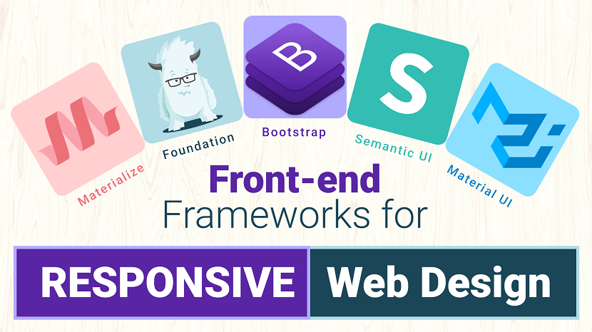
Front-end frameworks for responsive web design have become essentially important for the websites. There has already been too much buzz about the ongoing practice of using a responsive framework while initiating web designing. Because of the effectiveness of these frameworks, they are becoming more popular among the developers. Responsive frameworks are far better than the non-responsive ones. Additionally, they are effective and help in the development of user-centric applications.
Responsive web design front-end frameworks include CSS and HTML5 tags and thus they are the best choice to create exceptional website designs. There are several best front-end frameworks available to use to create exceptional websites. Here is a brief on some of the most renowned frameworks used popularly by developers.
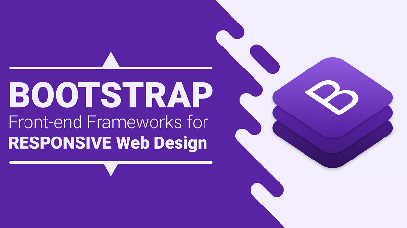
1. Twitter Bootstrap
This list would be woefully incomplete without the inclusion of the wildly popular frontend framework, Bootstrap. Created by Twitter developers and initially released in 2011, it's the most used open source framework in the world.
Like any effective frontend framework, Bootstrap includes CSS, HTML and JavaScript, or JS, components. It adheres to responsive web design standards, allowing you to develop responsive sites of all complexities and sizes.
Because it is updated continually, Bootstrap typically includes the latest and best features. For example, it added themes that met Google's material design guidelines shortly after they were published, and it was also upgraded to use Sass as a CSS preprocessor.
Pros:
- Massive community support.
- Widest variety of themes.
- Best browser capability.
- Has both a fluid and fixed pattern grid system.
- More development tools available.
- Many popular websites are built on this framework.
- Superiority in mobile support.
- Most of the celebrated custom web development companies prefer this tool.
Cons:
- Not as lightweight when compared to others. Out-of-the-box file size of 276 KB due to an excessive number of rarely used styles.
- Difficult to use jQuery plugins.
- Websites are easily recognizable.
- The excessive number of HTML classes and DOM elements can be messy and confusing.
Ideal for: Beginners and those who prefer a robust front-end framework.
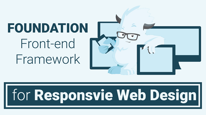
2. Foundation
Created by web design company Zurb, Foundation is a highly advanced, enterprise-grade frontend framework that is ideal for developing nimble, responsive websites. Used on sites like Facebook, eBay, and Mozilla, it is also fairly complex and may not be suitable for newbies.
This features-rich framework supports GPU acceleration for smooth, lightning fast animations and Fastclick.js for fast rendering on mobile devices. It runs on the Sass preprocessor and includes the Foundation-developed data interchange attribute, which lets you load lightweight HTML sections for mobile and "heavier" HTML sections for larger screens. For a comparison between Foundation and Bootstrap, read our complete article, Bootstrap vs Foundation.
Pros:
- Offers finest of the customization abilities.
- Possess a robust grid system.
- Provides rapid development of code.
- Easy to use templates available for download.
- Offers services for sites as well as emails.
- Design-it-yourself approach.
- Lightweight.
Cons:
- More complex when trying to customize.
- Not a great framework for beginners.
- Less popular in comparison to Bootstrap.
Ideal for:Developers who have decent amounts of experience and who are primarily concerned with developing fast, attractive, responsive websites.
3. Semantic UI
A relative newcomer on the scene, Semantic-UI stands out in several ways and is poised to become one of the most popular front-end frameworks out there.
This framework's main claim to fame is its simplicity. Because it uses natural language, the code is self-explanatory. Even those with very little coding experience will feel fairly at home working with this framework.
Another notable feature of Semantic-UI is that it is integrated with a dizzying array of third-party libraries. So much so, that you probably won't need to use any others. Therefore, the development process is a bit easier and more streamlined.
Pros:
- Semantic class names make for a low barrier of entry, so even beginners can hit the ground running.
- Small file sizes and minimal load times because you can load only the components that you need; each has its own JS file and style sheet.
- Versatile elements make for easy customization.
Cons:
- Very large packages when compared to Foundation and Bootstrap.
- Those with more complex design and development needs may find this framework lacking.
Ideal for: Beginners and those who want a lightweight, nimble framework.
4. Material UI
If you're looking for a front-end framework that makes it easy to adhere to Google's material design guidelines, you can't go wrong with Material UI. It is by far the most elaborate framework to implement these guidelines thus far, but there is one caveat: It isn't meant to be a starting point for a brand-new web design project.
Loaded with ready-to-use CSS and material design-compliant components, Material UI uses a CSS-in-JS solution. This unlocks many great features including theme nesting, dynamic styles, self-support, etc.
Pros:
- The easiest way to meet Google's material design guidelines when using a framework.
- Highly customizable.
Cons:
- Not intended to serve as a starting point for from-scratch web design projects.
- Need a decent understanding of React to use effectively.
Ideal for: Developers who understand and have experience with React and who need an easy way to adhere to material design guidelines.
5. Materialize
The Materialize responsive front-end development framework also implements Google's material design specifications and is loaded with ready-to-use buttons, icons, cards, forms, and other components. It is offered in both a standard version and in one that runs on Sass.
Materialize includes a convenient IZ column grid feature that can be used for website layouts. It is also loaded with CSS that's ready to use out of the box for material design shadows, typography, colors, and other features.
Additional features include ripple-effect animation, drag-out mobile menus, Sass mixins, and more.
Pros:
- Huge selection of components.
- Responsive support ensures that websites are supported across all devices.
Cons:
- The large file size makes this a bulky framework to work with.
- No support for Flexbox model.
Ideal for: Less experienced developers who need guidance regarding Google's material design specifications.
6. UIKit
UIKit is a highly modular front-end framework that stands out among most front-end development frameworks for many reasons. Chief among them is the fact that it includes both Less and Sass CSS preprocessors.
Loaded with an array of nimble, responsive components with consistent naming conventions, UIKit has become one of the most popular front-end frameworks out there.
It's more than 30 extendable, modular components can be combined for even more versatility. It includes navigation components like side navigation bars; elements like HTML forms and tables; JavaScript components like off-canvas bars and modal dialogs; common elements like buttons, badges, and overlays; and layout components, including a fluid, completely responsive grid system.
Pros:
- Highly customizable.
- Exceptionally modular, so you can add components to the style sheet without negatively impacting overall style.
- Create advanced user interfaces using components like nestable.
Cons:
- Very few resources out there due to the relative newness.
Ideal for: Fairly experienced developers due to the current lack of available resources. Otherwise, it is great for simple and complex projects alike.
7. Pure
Created by the Yahoo development team, Pure comes with a lightweight array of CSS modules that can be used in just about any project. Using Pure, you can easily create responsive buttons, menus, grids, tables, and other features. Because it is purely CSS based, however, it does not support JavaScript or jQuery plugins.
When minified and compressed with Gzip, Pure clocks in at just 4.5 KB, making it one of the lightest and nimblest front-end development frameworks out there. As a result, it is terrific for mobile website development, and many developers rely on it for precisely that.
Pros:
- Extremely lightweight, ensuring fast loading times even on mobile devices.
- A flexible array of CSS modules can be used on just about any web design and development project.
Cons:
- CSS only - does not include jQuery or JS plugins.
Ideal for: Developers who are focusing on creating responsive, fast mobile websites.
8. CreateJS
CreateJS is a suite of open-source JavaScript libraries and tools for creating rich, interactive HTML5 content. It consists of 5 modular JavaScript libraries. It will help you with implementing animation effects, supporting HTML5 audio on your website, and much more.
Adobe, Microsoft, and AOL sponsor this project.
Pros:
- It is helpful for rich, interactive HTML5 content.
Cons:
- You have basic knowledge of JavaScrip.
Ideal for: It is ideal for creating animation effects and HTML5 Audios on your website.
9. HTML5 Boilerplate
In 2010, HTML5 Boilerplate became one of the first, and subsequently, most popular open-source front-end web development tools for getting HTML5 websites and web apps up and running in no time. It’s a compilation web development solution that enables our websites to support modern web browsers.
Included in HTML5 Boilerplate is a mobile-friendly HTML template, placeholder icons, CSS resets for normalizing/standardizing your stylesheet property values, standard media queries for popular viewing screens, an HTML5shiv for non-modern web browsers, and more.
Pros:
- It is an open-source front-end web development tool.
- Mobile-friendly HTML template.
Cons:
- It required basic knowledge of HTML/HTML5 and CSS/CSS3.
Ideal for: It is ideal for designing responsive websites.
10. Milligram
Milligram is another extremely lightweight framework similar to Skeleton. When Gzipped, it comes out to just 2 KB in size and is used to provide developers with a simplistic and convenient starting point.
Milligram’s grid system is different than most because of its use of the CSS Flexible Box Layout Module standard. It also includes a few key components for getting you started including typography, buttons, forms, lists, tables, blockquotes, etc.
Pros:
- Very lightweight, only 2 KB when Gzipped.
- Uses CSS Flexbox as the grid system.
Cons:
- Few resources available due to the relative newness.
- Minimal styling components available compared to other larger frameworks.
Ideal for: Developers who are creating a small project that doesn't require any styling components and want to use a CSS Flexbox grid system.
11. Susy
Some would argue that Susy isn't a Front-end Framework in the truest sense of the term because it is focused on solving complex layout needs. Many classify Susy as a grid maker more than anything, but it can be an indispensable tool for those who have specialized layout needs.
Susy arms you with mixins that can be used to create grids. The framework does all of the calculations for you, saving a lot of time and effort.
With Susy, you can create any kind of grid layout imaginable. If you have been looking for a way to do this, Susy may be the answer.
Pros:
- Superior flexibility, so you can create any kind of grid layout that you need.
- Automatically performs all calculations.
Cons:
- Does not cover all aspects of website design, so you still need another framework solution.
- No pre-built grids.
Ideal for: Anyone who has unique or specialized layout requirements.
12. Zebra
Zebra is a rich UI open-source framework that leverages HTML5 canvas as the backbone of its rendering abilities.
Zebra says that using it “isn’t rocket science” and that you can get started in 5 minutes.
13. Siimple
Flexible, aesthetically built and a concise front-end CSS framework to accomplish clean web pages. Siimple is beautiful and mostly used for building web pages that are flat and clean. Working on these simple things sometimes proves to be exceptionally well for the development of user-centric websites. This framework is certainly minimal, having a few lines of codes that can also be zipped down to 6KB in total size. This framework is suitable for newbies who are just starting with their website designing and require a framework to experiment freely. Siimple helps such developers to create minimal and clean web designs.
14. Less Framework
Less Framework is a modern Front-end framework for building responsive designs. Similar to Skeleton (discussed above), Less Framework focuses on being just a plain and simple layout grid framework.
It has 4 pre-built layouts: Default, Tablet, Mobile, and Wide Mobile.
15. Montage HTML5 Framework
Being an HTML5 framework, Montage is great to kick start modern web page development. Montage has got the elements that help in the creation of scalable and feature-rich websites. These exceptional elements also help to maintain the HTML5 applications for a range of devices whether a desktop or a smartphone. Montage is amazing in its ways. It has got reusable components along with HTML templates in addition to the declarative component model, declarative data binding, and much more than it.
16. SproutCore
SproutCore is a front-end framework for building HTML5 apps rapidly.
It follows the MVC architecture pattern and promises its users the ability to craft native-like user experiences for the Web.
17. Cascade
Cascade is a great relief to the developers as it offers both semantic and non-semantic grid layouts along with base templates, navigational elements, table designs. Cascade has got a universal approach and thus it is easy for designers to include several elements in their design. With Cascade in use, designers, as well as developers, have got the option of creating high-performance web pages for a variety of browsers right from the older ones to the new browsers. Cascade can be used by developers to choose and work on the components most important for a particular project.
18. Skeleton
Skeleton is a lightweight responsive boilerplate that contains only 400 lines of code. This framework is meant to include only the minimum requirements to get you started on the development of a web project. It is not meant to be all-inclusive such as other frameworks as mentioned above.
Skeleton is also responsive, based on a 12-column grid system, and includes the bare essentials such as buttons, lists, tables, forms, etc.
Pros:
- Extremely lightweight.
- Greater simplicity and useful for smaller projects.
Cons:
- It does not include a wide selection of utility/styling components such as larger frameworks do.
Ideal for:Someone who is creating a smaller project that doesn't require all of the style components of a larger framework.
19. HTML KickStart
One of the newest kids on the block, HTML5 KickStart is a lean and mean package of HTML, CSS, and JavaScript files that promises to save UI developers hours of work.
At about 300KB, HTML KickStart packs quite a punch: UI components like stylish buttons and navigation bars, scalable icons (using Font Awesome), a responsive grid layout, a touch-enabled slideshow component and so on.
FAQs - Front-end frameworks
1. Which is the Best CSS Framework?
Answer : That depends on the website you’re looking to build. The most popular CSS framework, however, is Bootstrap.
2. What is a CSS Framework?
Answer : A CSS framework is a library of CSS stylesheets with pre-done code to help you design websites faster.
3. Why Do CSS Frameworks Use Preprocessors?
Answer : CSS frameworks use preprocessors to automate tasks.
4. Which Files Do You Need for CSS Frameworks?
Answer : You need CSS files from respective frameworks and sometimes JavaScript and HTML files.
Conclusion
There are plenty of Front-end frameworks, but we have chosen the best Front-end frameworks that matter in 2023. Out of these 19, we cannot say which one is best, as each has its own set of features. By choosing the right Front-end frameworks for your needs, all the complicated and time-consuming styling is taken care of, and you can focus on writing business logic.
If you’re just starting out with CSS and UI, go for Pure, or Skeleton. However, to build more complex elements, you’ll need a more inclusive framework like Bootstrap, Foundation, Material UI etc. read our complete article, Bootstrap vs Foundation.
If you found this article helpful, we encourage you to share it on your social media platforms—because sharing is caring! For more information about article submissions on our website, feel free to reach out to us via email.
Send an email
Written by RGB Web Tech
Latest Technology Trends
Latest technology trends shaping the future, including AI advancements, blockchain innovation, 5G connectivity, IoT integration, and sustainable tech solutions. Explore breakthroughs in quantum computing, cybersecurity, augmented reality, and edge computing. Stay ahead with insights into transformative technologies driving innovation across industries and revolutionizing how we live, work, and connect.
Bootstrap Front End Framework for Web Design
Last updated on January 19, 2025 by RGB Web Tech
Bootstrap is a free and open-source CSS framework directed at responsive, mobile-first front-end web development. It contains CSS- and (optionally) JavaScript-based design templates for typography, forms, buttons, navigation, and other interface components.
Highlights:
- Author: Mark Otto, Jacob Thornton
- Developer's: Bootstrap Core Team
- Initial release: August 19, 2011
- Written in: HTML, CSS, Less (v3), Sass (v4) and JavaScript
- Platform: Web platform
- Open-source: Yes
- Website: https://getbootstrap.com
- Alexa Rank: 2,108
Bootstrap 4 Alpha 6 Features:
1. Rewritten grid system in flexbox: They improved the grid system with three major changes. Here, one can disable the grid classes by the SASS variable. You can add a grid customization section to the documents. You will see also witness simplified grid classes. These changes are available in both standard and flexbox grids.
2. Flexbox by default: Along with flexbox being the default system. There are flexbox grids, also available, apart from standard ones. And new flexbox alignment utility classes at hand for distributing items as well.
3. IE9 support: Bootstrap CSS has released this long-awaited update of IE9 support.
4. Forms: With development to Alpha 4, there are significant changes in forms. There are necessary improvements in sizing, alignment, and component layout. The ‘fresh form validation and help text options are ready. And the documentation for forms is simplified too.
5. Automatic equal-width grid columns: Breakpoint-specific column classes can be employed for columns with equal width.
6. Updated and improved Navbar: Earlier there were certain styles for nav components that could not be set by variables. This update takes care of that and also adds some new features to it.
7. Auto margins for easy spacing: They improved the auto margins for easy spacing.
8. Change in system fonts: Helvetica/Arial font was old system fonts. They are replaced with a system font stack of modern, and strong fonts. This is done for companies like Apple, Google, Mac, to target the latest devices. Although, there is no such update available for Linux users.
Pros:
- Massive community support.
- Widest variety of themes.
- Best browser capability.
- Has both a fluid and fixed pattern grid system.
- More development tools available.
- Many popular websites are built on this framework.
- Superiority in mobile support.
- Most of the celebrated custom web development companies prefer this tool.
Cons:
- Not as lightweight when compared to others. Out-of-the-box file size of 276 KB due to an excessive number of rarely used styles.
- Difficult to use jQuery plugins.
- Websites are easily recognizable.
- The excessive number of HTML classes and DOM elements can be messy and confusing
Popular Brands Using Bootstrap:
- Lyft
- Vogue
- Riot Design
- Newsweek
Ideal for: Beginners and those who prefer a robust front-end framework.
Bootstrap Alternatives: If you want to explore more responsive Front-end Frameworks for your upcoming projects than you can Visit Here.
Bootstrap Alternatives: If you want to explore bootstrap alternatives. Visit Here
Bootstrap, originally named Twitter Blueprint, was developed by Mark Otto and Jacob Thornton at Twitter as a framework to encourage consistency across internal tools. Before Bootstrap, various libraries were used for interface development, which led to inconsistencies and a high maintenance burden.
After a few months of development by a small group, many developers at Twitter began to contribute to the project as a part of Hack Week, a hackathon-style week for the Twitter development team. It was renamed from Twitter Blueprint to Bootstrap and released as an open-source project on August 19, 2011. It has continued to be maintained by Mark Otto, Jacob Thornton, and a small group of core developers, as well as a large community of contributors.
Bootstrap 2
On January 31, 2012, Bootstrap 2 was released, which added built-in support for Glyphicons, several new components, as well as changes to many of the existing components. This version supports responsive web design, meaning the layout of web pages adjusts dynamically, taking into account the characteristics of the device used (whether desktop, tablet, or mobile phone).
Bootstrap 3
The next major version, Bootstrap 3, was released on August 19, 2013. It redesigned components to use flat design and a mobile-first approach.
Bootstrap 4
Mark Otto announced Bootstrap 4 on October 29, 2014. The first alpha version of Bootstrap 4 was released on August 19, 2015. The first beta version was released on 10 August 2017. Mark suspended work on Bootstrap 3 on September 6, 2016, to free up time to work on Bootstrap 4. Bootstrap 4 was finalized on January 18, 2018.
Significant changes include:
- Major rewrite of the code.
- Replacing Less with Sass.
- Addition of Reboot, a collection of element-specific CSS changes in a single file, based on Normalize.
- Dropping support for IE8, IE9,[contradictory] and iOS 6.
- CSS Flexible Box support.
- Adding navigation customization options.
- Adding responsive spacing and sizing utilities.
- Switching from the pixels unit in CSS to root ems.
- Increasing global font size from 14px to 16px.
- Dropping the panel, thumbnail, pager, and well components.
- Dropping the Glyphicons icon font.
- Huge number[quantify] of utility classes.
- Improved form styling, buttons, drop-down menus, media objects, and image classes.
- Bootstrap 4 supports the latest versions of Google Chrome, Firefox, Internet Explorer, Opera, and Safari (except on Windows). It additionally supports back to IE9 [contradictory] and the latest Firefox Extended Support Release (ESR).
Bootstrap 5
Bootstrap 5 is a updated version of bootstrap4 and Bootstrap 5 alpha was officially released on June 16, 2020 after several months of refining. With all of the major changes in this version, the Boostrap 5 development team informed the users that the current version is still in alpha version thus, breaking changes will continue to occur until the first beta is released so it’s better to always check the open issues and pull requests on their official GitHub repository for open questions and feedback.
Summary of the most important changes:
- jQuery was removed
- Switch to Vanilla JavaScript
- Drop Internet Explorer 10 and 11 support
- Improved grid system
- Improved documentation
- Improved modularity
- Improved forms
- New responsive font
- New utilities & helpers
- Easier customization & theming
- Lighter package
- New API available
Bootstrap Alternatives: If you want to explore more responsive Front-end Frameworks for your upcoming projects than you can Visit Here.
If you found this article helpful, we encourage you to share it on your social media platforms—because sharing is caring! For more information about article submissions on our website, feel free to reach out to us via email.
Send an emailWritten by RGB Web Tech
Latest Technology Trends
Latest technology trends shaping the future, including AI advancements, blockchain innovation, 5G connectivity, IoT integration, and sustainable tech solutions. Explore breakthroughs in quantum computing, cybersecurity, augmented reality, and edge computing. Stay ahead with insights into transformative technologies driving innovation across industries and revolutionizing how we live, work, and connect.
Foundation Front-End Frameworks for Web Deisgn
Last updated on January 19, 2025 by RGB Web Tech
Foundation is a CSS framework designed by ZURB in September 2011. It has a slightly more advanced interface compared to other frameworks. Foundation is compatible on multiple browsers and hand held devices. The responsive menu is one of its greatest assets. The menu is incredible when it comes to functionality and can also be easily styled using CSS. This responsive framework allows designers and developers to create elegant websites with more of a design-it-yourself approach. It has responsive grid ( HTML & CSS) UI components, templates, and code snippets, including typography, forms, buttons, navigation and other interface elements, as well as optional functionality provided by JavaScript extensions.
Highlights
- Developer's: ZURB
- Initial release: September 2011
- Written in: HTML, CSS, Sass and JavaScript
- Open source: Yes
- Website: get.foundation
- Alexa Rank: 36,606
Foundation 6.4 Features:
1. Includes XY grids: The latest version of Foundation includes a strong default grid system namely XY grids. This makes you control the layouts displayed both horizontally and vertically.
2. Flexbox by default: Although there is a feature available which allows the fall back to float-mode, Flexbox is what they recommend.
3. Smooth scrolling: This feature can be used to create “smooth scroll” behavior for any link available inside the page.
4. Shifted to ES2016 JavaScript: Foundation moved its javascript architecture to ES2016 module-based architecture. If one does not have a module bundler. The drop-in compiled JS files in dist/js will provide backward compatibility.
5. Easier prototyping: The process of prototyping and production often confuses people. With this feature, Foundation offers a better way and a “prototype mode” to speed up the prototyping function.
Pros:
- Offers finest of the customization abilities.
- Possess a robust grid system.
- Provides rapid development of code.
- Easy to use templates available for download.
- Offers services for sites as well as emails.
- Design-it-yourself approach.
- Lightweight.
Cons:
- More complex when trying to customize.
- Not a great framework for beginners.
- Less popular in comparison to Bootstrap.
Popular brands using Foundation
- Adobe
- Amazon
- Ebay
- Pixar Projection
- Washington Post
- Herschel Supply
Ideal for: Developers who have decent amounts of experience and who are primarily concerned with developing fast, attractive, responsive websites.
Foundation Alternatives: If you want to explore more responsive Front-end Frameworks for your upcoming projects than you can Visit Here.
Foundation emerged as a ZURB project to develop front-end code faster and better. In October 2011, ZURB released Foundation 2.0 as open source under the MIT License. ZURB released Foundation 3.0 in June 2012, 4.0 in February 2013, 5.0 in November 2013, and 6.0 in November 2015. The team started working on the next version of Foundation for Sites 7 which most likely will drop support for older browsers and implement newer technologies like flexbox or maybe calculated grid system.
Foundation for Emails, formerly known as ZURB Ink, was released in September 2013.
Foundation for Apps was released in December 2014.
Foundation was designed for and tested on numerous browsers and devices. It is a mobile first responsive framework built with Sass/SCSS giving designers best practices for rapid development. The framework includes most common patterns needed to rapidly prototype a responsive site. Through the use of Sass mixins, Foundation components are easily styled and simple to extend.
Since version 2.0 it also supports responsive design.This means the graphic design of web pages adjusts dynamically, taking into account the characteristics of the device used (PC, tablet, mobile phone). Additionally, since 4.0 it has taken a mobile-first approach, designing and developing for mobile devices first, and enhancing the web pages and applications for larger screens.
Foundation is open source and available on GitHub. Developers are encouraged to participate in the project and make their own contributions to the platform.
1. Grid system and responsive design: Foundation comes standard with a 940 pixel wide, flexible grid layout. The toolkit is fully responsive to make use of different resolutions and types of devices: mobile phones, portrait and landscape format, tablets and PCs with a low and high resolution (widescreen). This adjusts the width of the columns automatically.
2. Understanding CSS stylesheet : Foundation provides a set of stylesheets that provide basic style definitions for all key HTML components. These provide a browser and system-wide uniform, modern appearance for formatting text, tables and form elements.
3. Reusable components : In addition to the regular HTML elements, Foundation contains other commonly used interface elements. These include buttons with advanced features (for example, grouping of buttons or buttons with drop-down option, make and navigation lists, horizontal and vertical tabs, navigation, breadcrumb navigation, pagination, etc.), labels, advanced typographic capabilities, and formatting for messages such as warnings.
4. JavaScript components and plug-ins : The JavaScript components of Foundation 4 were moved from jQuery Javascript library to Zepto, on a presumption that the physically smaller, but API-compatible alternative to JQuery would prove faster for the user. However, Foundation 5 moved back to the newer release JQuery-2. "jQuery 2.x has the same API as jQuery 1.x, but does not support Internet Explorer 6, 7, or 8." The official Zurb blog explains, and the unsigned writer claims that the switch back was due to issues of compatibility with customized efforts; and that performance was found to be not as good, on use testing with the newer jQuery-2.
Foundation jQuery components provide general user-interface elements and branded extensions. The list includes dialog, tooltips, carousels, alerts, clearing, cookies, dropdown, forms, joyride, magellan, orbit, placeholder, reveal, section, topbar, flex video, and many others. Additional jQuery plug-ins can be installed into the Foundation framework to provide advanced functionality in any UI area, including animation and "off-canvas" elements like slide-in menus.
Foundation Alternatives: If you want to explore more responsive Front-end Frameworks for your upcoming projects than you can Visit Here.
If you found this article helpful, we encourage you to share it on your social media platforms—because sharing is caring! For more information about article submissions on our website, feel free to reach out to us via email.
Send an emailWritten by RGB Web Tech
Latest Technology Trends
Latest technology trends shaping the future, including AI advancements, blockchain innovation, 5G connectivity, IoT integration, and sustainable tech solutions. Explore breakthroughs in quantum computing, cybersecurity, augmented reality, and edge computing. Stay ahead with insights into transformative technologies driving innovation across industries and revolutionizing how we live, work, and connect.
Comparison Bootstrap Between Foundation
Last updated on January 19, 2025 by RGB Web Tech
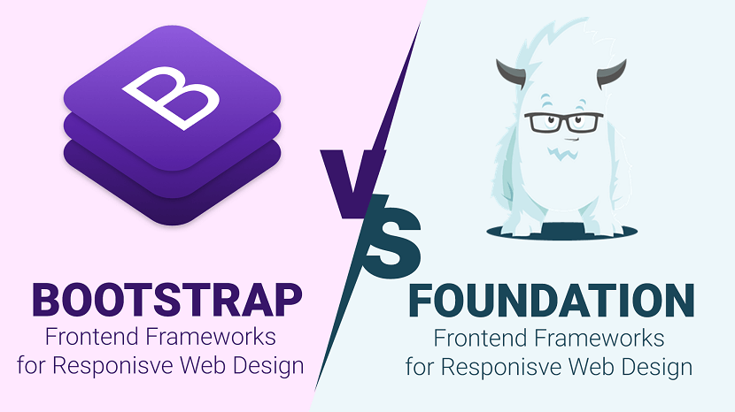
When it comes to being a developer and designer you usually always reach a crossroads of which CSS framework should you use? There are so many Front-end frameworks, but two of the most commonly mentioned ones are Bootstrap and Foundation.
Here is a comparison between Bootstrap and Foundation:
| Parameters | Bootstrap | Foundation |
|---|---|---|
| Current Version | V 4.0 alpha 6 | V 6.4 |
| Preprocessors | Less & Sass | Sass |
| Grid system | Flexbox-based | Floated (flexbox in latest version) |
| Customization | Basic GUI customizer | Basic GUI customizer |
| Community | 112k + (stars on Github) | 25.8k + (stars on Github) |
| Browser support | Chrome (Mac, Windows, iOS, and Android), Safari (Mac and iOS only), Firefox (Mac and Windows), Opera (Mac and Windows) IE9+ | Chrome (Mac, Windows, iOS, and Android), Safari (Mac and iOS only), Firefox (Mac and Windows), Opera (Mac and Windows), IE9+ |
| Design | Customizable; a variety of designs. | Not that appealing |
| Normalization/ Reset | reboot.css | normalize.css |
| Inline forms | Yes | No |
| License | MIT | MIT |
| Website | getbootstrap.com | get.foundation |
Front-end Frameworks List: If you want to explore more responsive Front-end Frameworks for your upcoming projects than you can Visit Here.
Conclusion: In order to make a conclusion which framework is better, you have to decide which one suits your requirements. In order to decide you must go through the features that each has to offer. With the given features currently listed, you must overlook that Foundation is quickly evolving and new updates are released frequently. Simply put, Foundation offers a slightly more complex, but a do it yourself style approach that will create something more unique and custom. Whereas Bootstrap allows for easy creation of simple yet elegant websites, with very little knowledge of CSS and JavaScript. Any CSS framework you chose will drastically simplify the web development process and provide the necessary foundations to build an amazing website.
If you found this article helpful, we encourage you to share it on your social media platforms—because sharing is caring! For more information about article submissions on our website, feel free to reach out to us via email.
Send an emailWritten by RGB Web Tech
Latest Technology Trends
Latest technology trends shaping the future, including AI advancements, blockchain innovation, 5G connectivity, IoT integration, and sustainable tech solutions. Explore breakthroughs in quantum computing, cybersecurity, augmented reality, and edge computing. Stay ahead with insights into transformative technologies driving innovation across industries and revolutionizing how we live, work, and connect.
What is the best CSS Framework
Last updated on January 19, 2025 by RGB Web Tech
When it comes to being a developer and designer you usually always reach a crossroads of which CSS framework should you use? There are many out there to choose from, but two of the most commonly mentioned ones are Bootstrap and Foundation. In this post, we will be comparing the two CSS frameworks, Bootstrap vs Foundation. Read more below about how using a framework can help speed up and streamline your development and design process.
What is a CSS framework?
Building a website or app from scratch can take a lot of time and development. A CSS framework is commonly used by developers and designers as a tool to speed up the process. A CSS framework, also sometimes referred to as a frontend framework, is essentially a package that is made up of predefined HTML, CSS, and JS which can be used when starting to build out a project. This way you don't have to code from a blank slate every time you need to create a website or web application. In this post, we are specifically focusing on frontend frameworks which usually have to deal with what the visitor actually sees.
A CSS framework usually consists of the following components:
- HTML code which helps make up the structure of the pages.
- Typography styles.
- CSS to visually change how elements appear (a standard set of easy to use classes).
- JavaScript to change dynamic elements such as drop downs, expanding menus, etc.
- Responsive media queries.
- Cross-browser compatibility fixes.
Front-end Frameworks List: If you want to explore more responsive Front-end Frameworks for your upcoming projects than you can Visit Here.
If you found this article helpful, we encourage you to share it on your social media platforms—because sharing is caring! For more information about article submissions on our website, feel free to reach out to us via email.
Send an emailWritten by RGB Web Tech
Latest Technology Trends
Latest technology trends shaping the future, including AI advancements, blockchain innovation, 5G connectivity, IoT integration, and sustainable tech solutions. Explore breakthroughs in quantum computing, cybersecurity, augmented reality, and edge computing. Stay ahead with insights into transformative technologies driving innovation across industries and revolutionizing how we live, work, and connect.
Advantages and Disadvantages of Front-End Frameworks
Last updated on January 19, 2025 by RGB Web Tech
As developers, we often find ourselves looking for ways to be more efficient. For many of us, this means turning to front-end frameworks. Whether it is robust, full-featured frameworks like Bootstrap or Foundation or more foundational frameworks such as Skeleton or Pure, developers are turning to these tools to get a jumpstart on web projects.
Advantages of Using a Front-end Framework
First, let’s take a look at a few Advantages of using a front-end framework.
- Easy and quick to get started.
- They are great for prototyping.
- You can gain momentum by “getting something on the page”.
- They are handy when you are against tight deadlines.
- They provide a solid foundation for responsive design.
- Components of the UI have a base style to be extended (forms, buttons, navbar, etc.)
- The base styles persist throughout.
- They provide a consistent UI design for developers who lack design skills, which is great for things like intranet sites or documentation.
- They provide a base development for non-developers to get something up quick for prototyping or mockups.
Good looking UI, even out-of-the-box
- Components of the UI have a base style to be extended (forms, buttons, menus, etc.)
- The base styles persist throughout.
- They provide a consistent UI design for developers who lack design skills, which is great for things like intranet sites or documentation.
- They provide a base development for non-developers to get something up quick for prototyping or mockups.
Code is reliable and tested
- Code is widely used, especially open source.
- Cross-browser compatibility is built-in, so you know where it will work.
Help is readily available
- Front-end frameworks are widely used, so answers to common problems are easy to find.
- The documentation is usually thorough.
- Free and professional themes and templates may be available.
Disadvantages of Using a Front-end Framework
While development frameworks have been gaining in popularity over the past few years, not all frameworks are created equal and often a front-end framework is not the right tool for the job. Here are a few disadvantages I have found to using them:
They can be too opinionated
Although they are easy to get started, they can require more time down the road to add features and customizations. You might find yourself fighting the base styles with overrides (wasting all that precious time you saved) to get the desired results. This can also lead you to write code that does not evolve gracefully as the project needs change.
Note: Some of these risks can be mitigated by selecting a framework which is more flexible or closely resembles your project. I would advise testing out different frameworks, so you have a better understanding of the advantages and limitations of these tools when a new project comes along.
You’re not learning how to code
It is easy to fall into the trap of only learning the framework and not learning how to develop. You often miss out on valuable experience with the underlying technology. If you are not already an expert, it is important to understand the code which powers the framework. This knowledge will make life a lot easier when you run into complex challenges and will make you a better developer overall.
Updates can introduce issues
- Updating may introduce conflicts with your code.
- When it comes to updates, at the mercy of the framework developers. Sure, you can choose not to update, but you then risk falling behind.
Technical debt
- Developers coming onto the project will need to understand the framework in order to contribute.
- “One-size-fits-all” frameworks tend to have a larger footprint and can add unnecessary bloat to your project.
Front-end Frameworks List: If you want to explore more responsive Front-end Frameworks for your upcoming projects than you can Visit Here.
Conclusion: As with most development decisions, the choice to use a framework and which framework to use should be made based on the requirements of a specific project. What may be perfect for a small marketing website, may not be so great for building a highly-customized web portal. With new frameworks popping up frequently, but as developers, it’s still important to be diligent in selecting frameworks that suit our needs and the needs of our clients.
If you found this article helpful, we encourage you to share it on your social media platforms—because sharing is caring! For more information about article submissions on our website, feel free to reach out to us via email.
Send an emailWritten by RGB Web Tech
Latest Technology Trends
Latest technology trends shaping the future, including AI advancements, blockchain innovation, 5G connectivity, IoT integration, and sustainable tech solutions. Explore breakthroughs in quantum computing, cybersecurity, augmented reality, and edge computing. Stay ahead with insights into transformative technologies driving innovation across industries and revolutionizing how we live, work, and connect.
How to Build a Responsive Website from Scratch
Last updated on January 19, 2025 by RGB Web Tech
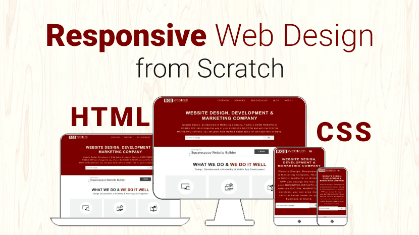
You can create custom responsive designs using just HTML and CSS only. Some of the great responsive email templates are designed in using just HTML and CSS because most of the email clients do not support Media Queries.
But you can’t make a complex custom responsive design by using HTML and CSS, for that purpose you need to use Media Queries and sometimes, even javascript
Today, a website must not look good only on a desktop screen, but also on tablets and smart phones.
A website is responsive if it can adapt to the screen of the client.
Responsive web design is extremely important nowadays and is one technique you need to master as a web designer.
In this article, I’ll show you how to easily build a custom responsive website and how to apply custom responsive design techniques on existing web pages in three easy steps.
Before you start a responsive design from scratch you need to keep some points in your mind as below:
1. Use meta tag in your website top of the header:
Viewpoint Meta Tag: Put viewport meta tag inside your page head area. This viewport tag will prevent the browser from zooming out the page. Thus it will remain the same width of the screen size.
Example:
2. Every code should be in % (percentage) instead of px (pixels).
Example:
3. Try to use flexbox layout as much as possible.
The Flexible Box Layout Module makes it easier to design a flexible responsive layout structure without using float or positioning.
Before the flexbox layout module, there were four layout modes:
- Block, for sections in a webpage.
- Inline, for text.
- Table, for two-dimensional table data.
- Positioned, for the explicit position of an element.
Example:
4. Beautify your design for tablets and smart phones screen by using media queries.
Now apply media queries in our CSS file, this is done with the help of condition statements. In the condition provide the min-width and max-width to target screen size.
Conclusion:
Hope you like this Responsive Website from scratch (HTML & CSS). I would also like to tell you that designing a responsive website from scratch can be a time-consuming job. There is also an easy alternative for responsive web design.
Alternatives of Responsive Web Design:
If you want to explore more responsive Front-end Frameworks for your upcoming projects than you can Visit Here.
If you found this article helpful, we encourage you to share it on your social media platforms—because sharing is caring! For more information about article submissions on our website, feel free to reach out to us via email.
Send an emailWritten by RGB Web Tech
Latest Technology Trends
Latest technology trends shaping the future, including AI advancements, blockchain innovation, 5G connectivity, IoT integration, and sustainable tech solutions. Explore breakthroughs in quantum computing, cybersecurity, augmented reality, and edge computing. Stay ahead with insights into transformative technologies driving innovation across industries and revolutionizing how we live, work, and connect.
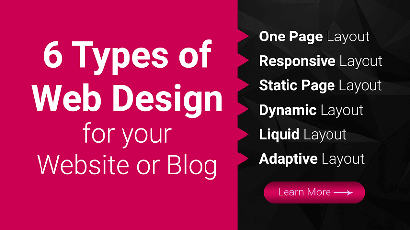
6 Types of Website Design for your Website or Blog
Last updated on January 19, 2025 by RGB Web Tech
With 94% of first impressions relying on website design, you must create a beautifully crafted website for your business or blog. But when you get started with web design service or looking for a web design package, you may not know what approach to take with your website. What types of web design are best for your business or blog?
Luckily for you, we have got all the answers. Keep reading to learn about six types of web design and the pros and cons of each:
- One Page Website
- Responsive Website
- Static Website
- Dynamic Layout
- Liquid Website
- Adaptive Website
Plus, we will cover the different types of websites you can create, so you can determine which one is best for your business! Need some marketing inspiration?
Subscribe to our email newsletter for more updates!
6 Types of Web Design for your Website or Blog
Ready to build your website but are not sure which web design format is best? Here are six of the most common web design layouts for your business and the pros and cons of each.
1. One Page Website
We will cover on our list of types of web design as a one page layout website. As the name implies, a one page layout website uses only a single page that users scroll down to find information about your products or services. With this design layout, you can have a “Navigation Menu” with links to specific points of your page.
Pros of Single Page Website:
- Easy to create.
- Can help you create a clean and simple website.
Cons of Single Page Website:
- Can not be used for businesses that sell products online.
- Can not be used for companies that need multiple pages.
- Can deter people away if the single page is too long and requires too much scrolling.
2. Responsive Website
Next on our list of types of website layouts is responsive design layout website. This layout format is the most popular type, as it allows your site to accommodate all devices and fill the browser size perfectly. Responsive design is built with a mobile first approach.
You create your mobile layout first, and then you expand your website for bigger browser sizes. So instead of trying to trim down your website and make it smaller, you start small and build it bigger.
Pros of Responsive Website:
- Get a website that’s built for mobile users.
- Delivers a seamless experience on all devices.
- Do not have to build a separate mobile site.
Cons of Responsive Website:
- Takes more time to build and develop.
3. Static Website
Most basic type of website design is a static page layout website. With this layout, you build a website with pre-set page dimensions. It has a permanent width. Static layouts stick to these dimensions, regardless of the browser or device type.
Static layouts have phased out with the rise of mobile usage. Since these sites do not adapt to devices, they do not provide a positive user experience on smartphones or tablets. While static layouts are still an option, you typically do not want to use them unless you are creating a completely separate mobile version of your site.
Pros of Static Website:
- Easy to set up.
Cons of Static Website:
- Not responsive to devices or browsers.
- Requires creating a separate mobile site (more work).
4. Dynamic Website
When you look at a list of the types of web design, you will see that the dynamic website layout is an option. Dynamic website layouts are great for people who do not have extensive HTML knowledge. These websites can deliver different content to website visitors, even if two separate people look at the same page.
With a dynamic website vs. static website, you build a database of information and features. Then, when a user requests a page, the web coding automatically works to put the components together from your database to form the webpage.
Pros of Dynamic Website:
- Interactivity with users.
- Increased functionality for users.
- Less coding skills required.
Cons of dynamic Website:
- Can be more complex to set up with different functionalities.
- Tend to load slower because of all the different elements and page compositions.
5. Liquid Website
Next on this list of types of website design is liquid design layout website. This layout, also known as Fluid Design, uses flexible units rather than the fixed units static layouts use. Since the units are flexible, the page will always fill the width with the device’s screen, regardless of what device it is.
Because user experience is critical to your site driving and engaging traffic, liquid layouts have also started to phase out as a viable option for businesses. While you can still use this layout, you risk delivering a poor user experience from your site stretching too far or squishing information together on the page.
Pros of Liquid Website:
- Easier to set up than responsive design
- No information gets cut off on pages
Cons of Liquid Website:
- If a browser is really wide, information gets stretched to fit the screen and can look unappealing
- If a browser is smaller, information gets smooshed together to fit the screen, making it difficult to read and browse
6. Adaptive Website
One web design format you can use for your site is adaptive website layout. As the name implies, this website uses CSS queries to adjust the website’s size to detect the size of the browser. Adaptive websites will automatically alter the website’s layout to provide the best user experience for visitors.
With adaptive website layouts, there are set parameters for how a website will adjust. For example, a set parameter may look like this: “If the browser is 500 pixels wide, set the main content container for 400 pixels wide.” For example, if you have a website with a two-column layout, the adaptive layout would change into a single-column design on a small browser screen.
Pros of Adaptive Website:
- Easy to set up.
- Takes less development time than responsive layouts.
- Can adjust your website according to each browser size.
Cons of Adaptive Website:
- Device widths in between set points can cause your site to have too much space or not enough space.
- Is not fully responsive.
Types of website layouts
Here is a list of different website layouts and which sites benefit the most from them:
1. F-shape layout
The f-shape layout creates a website design that follows the general viewing pattern of the site's visitors. Scientific studies have found that website users often view and move their eyes across a web page creating an F or E shape. Webpages that design their layout to match those instinctive eye movements can help capture visitors' attention more naturally. These types of layouts are most common for websites that display a lot of options for users to choose from, such as news websites and search engines, allowing users to scan the options quickly and make a decision.
2. Z-shape layout
The z-shape layout is very similar to the f-shape layout, except it targets a different group of individuals. Scientific studies have shown that individuals from western cultures use a z shape with their eyes more often than an f shape to navigate the pages of different websites. Z-shape layouts are often most effective for websites that have a singular goal, such as having consumers sign up for a service or purchase a product. Creating a button that navigates users to the next step of company interaction and placing it along the z-shape path can help increase customer outreach and revenue.
3. Grid of cards layout
A grid of cards layout displays information in a grid system that users or website visitors can easily manipulate by adjusting the size of the browser window or screen. Some of the most common sites that use a grid of cards layout are video streaming websites that display image previews for their different video options. They display each of the previews as cards in a grid system, and the number of visible video options changes based on the size of the screen.
A grid layout is great for websites, like video streaming services, that display a lot of options and information of equal value, which can help users find what they're looking for more easily.
4. Boxes layout
The boxes layout uses one larger box as a website's header, which displays an image and two smaller boxes underneath that provide additional images or information for users. Each box gives the user important or engaging information about the company's or website's purpose and links the user to other dynamic web pages they can explore to find more helpful information. Because the boxes can prominently display images, artists often use this layout to show their portfolio and businesses use it to display featured products.
5. Split screen layout
A split screen layout divides a website into two sections that users can choose to explore. This layout works well for companies and organizations that have two pieces of content that are equally important to their business and consumers. For example, a clothing company that sells women's and men's clothing might use the split screen layout to advertise their products. Having both options on the front webpage can allow users to pick which one they're looking for quickly and continue exploring the site.
6. Fixed sidebar layout
The fixed sidebar layout places a stationary menu of options for users on the left or right side of the webpage. This sidebar menu provides visitors with quick and helpful navigation choices, allowing them to explore the website more easily. The fixed sidebar layout often works best with websites that have a limited number of webpages to choose from, such as businesses that sell one major product. For example, if a company that sold watches used a fixed sidebar, some of their menu options could include: about us, online store and contact us.
7. Magazine layout
The magazine layout uses a design that resembles printed publications. This design displays a lot of information to visitors by using a system of columns and grids to help individuals navigate the webpage more easily. The magazine layout is often used by publication companies to resemble how their product might look in its printed form, which can help create a fun and engaging format for users, motivating them to continue reading and exploring.
8. Asymmetrical layout
Asymmetrical layouts ensure that the webpage promotes an uneven design, meaning one half of the page is often larger than the other. Companies and organizations often use this layout to create an aesthetically pleasing web page while directing users to a certain area of the site.
For example, a business might use the larger section of the website to display an image or company slogan, while using the smaller side to encourage users to fill out their contact information to learn about special sales and promotions. The smaller section often attracts the visitor's attention, encouraging them to engage with the website or company. Because of its ability to entice users, the asymmetrical layout is often used on a website's homepage.
Featured image layout
The featured image layout places a prominent and large image at the top of the webpage to attract users. Most often, the featured image is a picture of a popular product that a company or business is selling. Companies that sell aesthetically pleasing products often use this type of layout to immediately attract visitors' attention and encourage them to make a purchase. For example, a company that sells computers might use a featured image layout to display their computers' design and style.
10. Curated visuals layout
The curated visuals layout uses illustrated images to promote a product or service. Companies and organizations often use this layout to display a certain emotion they want users to feel when they use the webpage. This type of advertising strategy can help consumers feel motivated to interact with the company and possibly purchase their goods and services. Most often, businesses or companies with a complicated service that's difficult to sell might use curated visuals to help ease the experience and relay necessary information to users.
Types of websites
4 Types of websites you can create
In addition to narrowing down your list of types of website layouts to the best one, you also must determine what kind of website you need to create for your business. Every business has different needs, which means your site type may differ from others.
Here are four types of websites you can create for your business:
1. Business websites
First on our list is the type of website you can create as a business website. A business website is a standard site. It contains information about your company and the services you offer. If you do not sell products online, you may also build a business site just to showcase what you offer.
These sites are simple and serve as a hub for people to learn about your business. You can use this website type if you are not selling products on your website. For a business website, you can use any of the types of web design listed above. You will want to choose the ones that help you deliver the best experience for your audience.
2. Blog
Second on our list is the type of website you can create as a blog. Blogs are websites that share helpful information with readers about topics in their industry. While a blog may not be your company’s primary website, you may consider creating a blog site if you are doing content marketing.
Content marketing is a crucial strategy for helping your business grow online and build trust with your audience. You may consider having a separate blog website, or integrating it into your core website to help you take advantage of the benefits of content marketing.
This website type can use any type of web design format, except for one page layout website.
The best types of web design layouts for this website type are adaptive and responsive.
3. Ecommerce websites
Another type of website you can create for your business is an ecommerce website. This website type is best for your business if you want to sell products on your site. Ecommerce sites are built to host product pages, add products to a cart, and complete transactions.
If you’re looking to sell products, this website type is best for your business.
In terms of the best types of web design for an ecommerce website, responsive and adaptive are most suitable for an ecommerce site.
4. Membership websites
The last type of website you can create is a membership website. With this website type, you have a paywall for people to enter. Only people who have a membership can enter your site and see your products.
A1truejobs.com is a membership website example. You must create an account and pay the membership fee and become a member of the site.
If you want to use this website type, you can use two types of web design layouts: adaptive or responsive.
Need help figuring out which type of web design is best for you?
With so many types of web design available, it’s challenging to know which type is best for your business. If you’re feeling overwhelmed with building the best website, RGB Web Tech can help you to create a beautiful web design for your business or blog.
Our team experts can help you craft a beautifully designed website that delivers the best experience for your audience. Ready to build your dream website? Contact us online or call us today at +91-9878585860 to speak with a strategist about our web design services and affordable web design packages
If you found this article helpful, we encourage you to share it on your social media platforms—because sharing is caring! For more information about article submissions on our website, feel free to reach out to us via email.
Send an emailWritten by RGB Web Tech
Latest Technology Trends
Latest technology trends shaping the future, including AI advancements, blockchain innovation, 5G connectivity, IoT integration, and sustainable tech solutions. Explore breakthroughs in quantum computing, cybersecurity, augmented reality, and edge computing. Stay ahead with insights into transformative technologies driving innovation across industries and revolutionizing how we live, work, and connect.
12 Principles of Design & How to works
Last updated on January 19, 2025 by RGB Web Tech
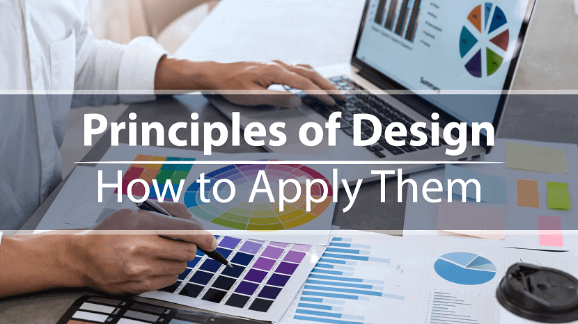
You can’t just flip a switch and create beautiful designs on a whim. Like learning to walk before you run, there are certain fundamentals you’ve got to learn first.
The problem is that if you don’t have the time or inclination to take a design course, resources are pretty scarce. Sure you can rely on Canva templates, but even then you need to know how to use them properly.
This is why we've put together this post. It’s for you if you’ve ever wondered what goes into good design. You'll find it handy whether you're a complete amateur or a budding designer—so let's get stuck in.
What are design principles?
Design principles are guidelines to follow if you want to create effective visuals, from oil paintings and blog graphics to eye-catching social media posts.
Think of design as carpentry and these principles as your toolbox. You can use them to help you during the design process, and unlike hammers, nails and screwdrivers, they can exist entirely inside your head.
These tools give you a better understanding—and appreciation—of what goes into the designs we see every day. As you become acquainted with them, you’ll start to see what does and doesn’t work (and why), as well as how you can apply these principles to your own creative work.
What is "good design"?
We’re told that piece of art is subjective. For the most part, that’s true. But if you’ve ever seen an unintelligible parking sign or a website from the early days of the web, you’ll know there’s definitely such a thing as bad design.
As Jared Spool, an expert on design and usability, says, “good design, when it’s done well, becomes invisible. It’s only when it’s done poorly that we notice it.” This is why good design is tricky to define.
Luckily for us, in the late 1970s, an influential designer named Dieter Rams saw this problem. In response, he asked himself what constituted good design and came up with his own list of ten principles.
Little did he know, they would go on to inspire generations of designers, including Johnny Ive, the mastermind behind Apple’s most famous products.
Rams’s principles are:
- Good design is innovative
- Good design makes a product useful
- Good design is aesthetic
- Good design makes a product understandable
- Good design is unobtrusive
- Good design is honest
- Good design is long-lasting
- Good design is thorough down to the last detail
- Good design is environmentally friendly
- Good design is as little design as possible
You might notice that these principles are aimed at product design. Rams worked at Braun, so products were in his wheelhouse, but these principles are easily adapted to UX, UI, or any other design context.
Rams’s principles aren’t the only principles out there. Other notable design principles include Nielsen’s 10 usability heuristics and Whitney Hess’s five guiding principles for experienced designers.
The 12 principles of design
These are the building blocks graphic designers and artists use to put creative works together; the core principles of art that make up every design, from the fine art of the Louvre to the boxes of Corn Flakes at the local grocery store.
1. Balance
Where objects in real life carry physical weight, elements in design carry visual weight. Large elements are heavier and small elements lighter, with each element having its own "weight" based on how much attention they draw.
Visual balance is about ensuring your design is equally weighted on both sides of the central point. It’s like a seesaw—too much weight on either side and the whole thing becomes unbalanced.
By striking this balance you create visual harmony and stop your design from feeling too chaotic to the viewer. It’s one of the most important parts of visual composition, and comes in three basic forms:
Symmetrical balance
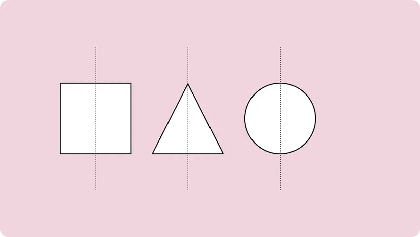
Symmetrical design uses an imaginary vertical (or sometimes horizontal) line to divide a design into two halves around a central point. Elements of equal visual weight are balanced on each side of the axis to create symmetry.
There are two variants of symmetrical balance: Reflectional symmetry, where the two halves are exact mirror images, and translational symmetry, where the same shape or elements are repeated on both sides of the design.
Asymmetrical balance
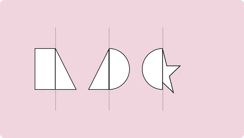
An asymmetric composition is when a design uses unequal weighted elements. One side might have a visually heavy element, balanced with multiple lighter elements on the opposite side.
To run with the seesaw example, it would be like having a 100kg weight on one side and 100 kg of feathers stacked on the other. It still achieves balance but provides a whole different experience.
Asymmetry is often more visually interesting. Where symmetrical designs can be quite static and predictable, asymmetrical balance can give designs a more dynamic feel.
Radial balance
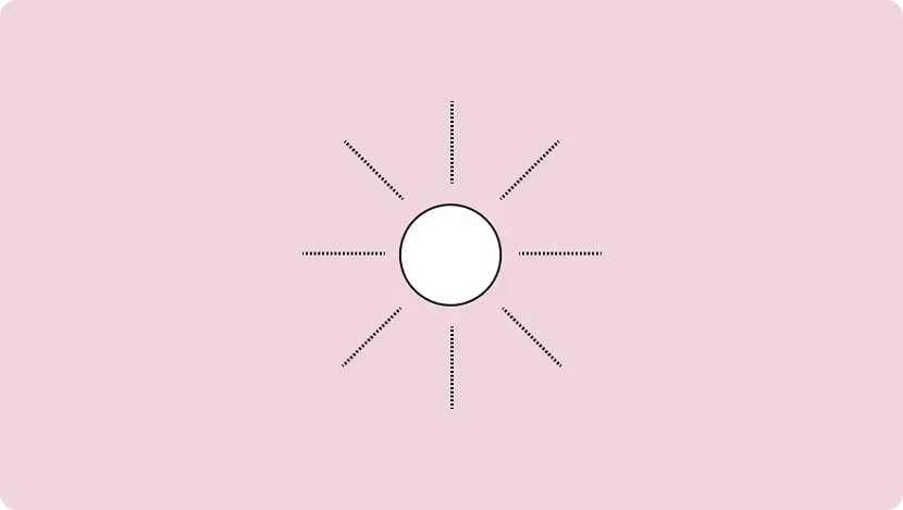
Radial balance is when elements “radiate” from a point in the centre of a design. Think of rays shining from the sun, petals blossoming from a rose, or a squirt of tomato sauce in the middle of a juicy meat pie.
This form of symmetry is a way to add depth and movement to a design and works to draw attention to an object in the centre of a composition.
2. Emphasis
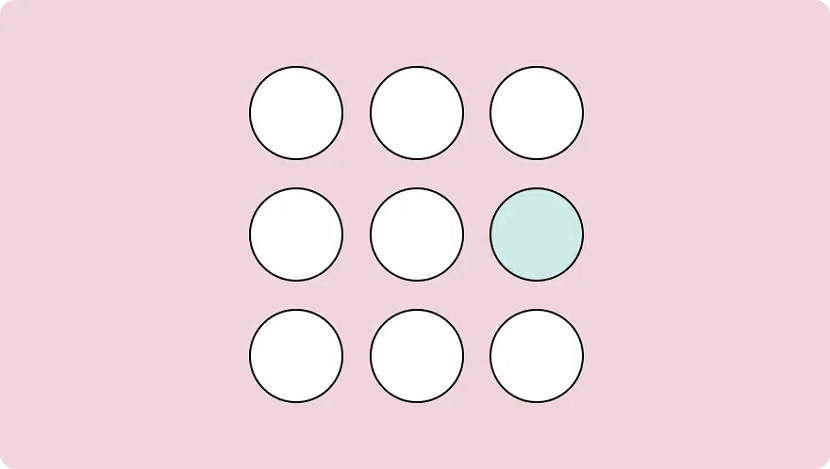
Emphasis is used to focus the viewer’s attention on a certain part of a composition. The effect is achieved by manipulating elements (like colour, shape and size) to make specific parts of a design stand out.
For example, say you wanted to bring attention to a call to action on a landing page. You could increase the text size and use colours that stand out from the background, emphasising the CTA and making sure visitors can’t miss it.
3. Repetition
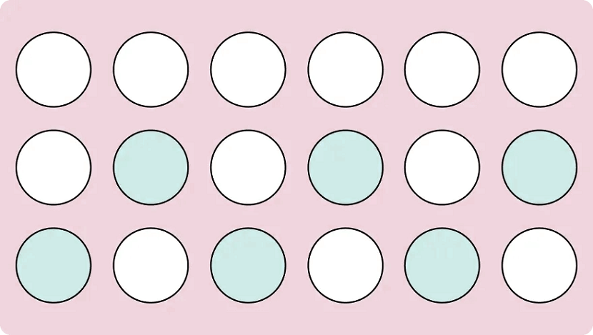
As you may have already guessed, repetition refers to when an element is repeated throughout a design. It could be anything, from using a certain font colour to adding a repetitive pattern to a social media post.
Repetition makes designs visually exciting and cohesive. It also creates a sense of consistency by using a repeating motif that the viewer comes to expect. This makes it particularly useful when it comes to creating your distinct brand identity.
Brand identity is the visible element of your brand. The colours; design; logo. It acts to distinguish your company from the millions of others out there, so when folks see your designs they immediately know it’s your business.
Every successful business uses repetition. Why do we equate the swoosh and “just do it” with Nike? The blue can with Pepsi? Because these visuals were repeated so often that eventually they became synonymous with the brands they represent.
So while repetition can just help you make a sweet iPhone wallpaper, it’s a crucial tool for any company looking to build a visual identity and brand recognition.
4. Movement
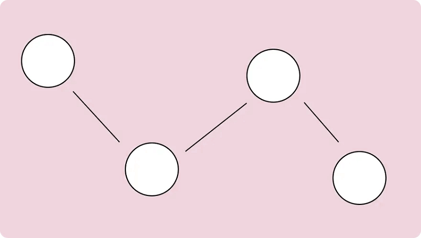
When we think of movement we think of, well, things moving. A pendulum swinging. A Ferrari roaring down the freeway. But in design, it refers to the path a viewer’s eye takes when they look over a composition.
It’s not just what you look at; it’s the way you look at it. Designers can guide this by using lines, edges, shapes and colours to create focal points and encourage certain ways of seeing.
Movement can be harnessed to distract, direct and pull the viewer’s gaze around a design. By using subtle cues (particularly with lighting and perspective) a savvy artist can control this entire process. You can use lines to create directional cues and make images feel more alive.
5. Proportion
Proportion is the relationship between two or more elements in a design, particularly the size and scale of them. When things are "proportionate”, it means there’s a coordination between them that makes the design look aesthetically pleasing.
For example, when you’re reading a blog post you expect headings to be larger than the body text. Or if you were looking at a realistic drawing of a tortoise and a hare, you expect the hare to be larger than the tortoise.
Proportion is about finding harmony between two elements. You want to make sure things look “right”— that the elements look as if they belong together.
This is something that comes up when creating digital assets and websites online. It’s the bane of many an amateur designer’s existence. Here are a few tips for keeping the elements in your design in proportion:
- Assemble elements that are identical or share a function.
- Establish major and minor areas in the design to prevent monotony and boredom.
- Ensure size variations are subtle (unless the objective is emphasis.) Avoid separating the composition into halves, quarters, and thirds. Try to keep a sense of balance.
You can also play with proportions in a variety of ways to emphasise elements or get a certain message across. It’s a strategy you’ll notice advertisements do often and is usually best used for more creative projects.
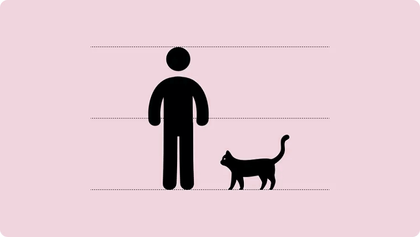
6. White Space
\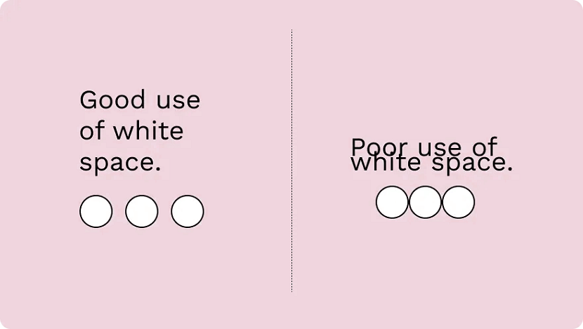
The region between different design elements is referred to as "negative” or “white” space. This is part of the design that doesn’t contain anything. No images, drawings, shiny colours or text. Nothing.
The name is kind of misleading — it’s not a "negative" thing and it doesn’t have to be "white". It can be any colour: white space refers to what you don’t add; the empty parts around and within your design.
It’s one of the fundamental building blocks of design and is just as important as any elements you do include. Think of it like a diet: what you eat matters, but what you don’t eat matters just as much.
“White Space in design composition is the same as the use of silence in a musical composition. Without proportionate use of silence, music is unstructured. Similarly, without white space, design is unstructured and difficult to consume." — Mark den Hartog
There are two types of white space: micro and macro. Micro white space is the space between small elements (like text), while macro white space refers to the area between large elements or surrounding a design.
7. Contrast
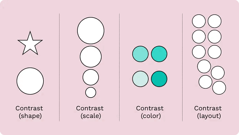
Contrast is produced when two or more visual elements in a composition are different. It can be used to create specific effects, emphasise the significance of certain elements, and add visual appeal to your designs.
Designs that look the same are boring—by experimenting with contrasting colour hues, shapes, sizes, textures and typography, you can liven things up. Humans tend to like contrast. It’s a great way to grab attention, control the visual flow and keep folks engaged.
Keep in mind that adding too many variations can be confusing for viewers (the opposite effect you want to have.) As with most of the different elements of art, it’s about striking a balance.
8. Hierarchy
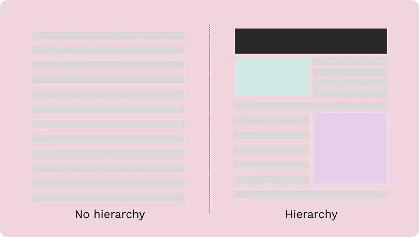
Visual hierarchy is about organising the value of the elements within your design. By ranking information from most important to least important, you make it easier for the viewer to digest your content.
This plays a critical role in UI and UX design. Ever noticed how most landing pages have the same layout? There’s a logo at the top, a menu at the top and then elements in descending order of importance below.
It’s not because they copied each other's homework—there’s a certain hierarchy that designers stick to in order to draw attention to the right things in the right order (and make it pretty to look at.)
The viewer’s eye should be drawn to the most important element first. These sit atop the throne at the top of the hierarchy, with the elements laid out below ranked in order of importance.
There are a number of visual tricks to influence this flow, including:
- Size and scale: The larger an element is the more likely a viewer is to see it. By making something smaller you can reduce its importance and put the emphasis elsewhere.
- Colour and contrast: A splash of colour makes a big difference. Use bright colours to make certain elements or information pop.
- Fonts: Use different typefaces and stylisations like italics and bold to draw the eye and move text higher or lower on the hierarchy.
- White space: White space enables you to give an element breathing room and make a central element stand out.
Patterns of hierarchy
People read a page in the same way: from top to bottom. But we don’t just stare blankly at s page and wait for information to register, we scan it.
The human eye tends to follow the same path during this process. For that reason, designers stick to two common patterns to make it faster to absorb information: the F-pattern and the Z-pattern.
The F-pattern applies to pages made up mostly of text, like an online or printed article. Readers scan in the shape of an “F”—first, with the headline across the top, then down the left side of the page and to the right as they identify things they find interesting.
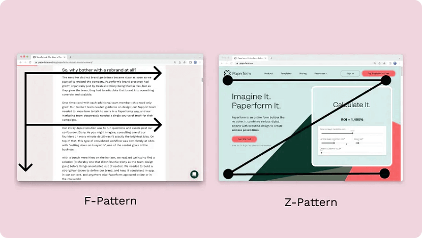
Designers use a Z-pattern for layouts with less text and more visuals. With this pattern, viewers scan across the top of the page and then diagonally down towards the opposite corner. They then scan the bottom in the same way as the top.
Most websites are designed in this way (including Paperform). Notice how the most important parts like the logo and navigation menu are at the top, while the secondary information like clients and chatbot is at the bottom.
9. Rhythm
Don’t worry, you can leave your dancing shoes at home. In design, rhythm hasn’t got anything to do with the way you move your hips. It’s about giving your composition a feeling of action and movement.
Designers create rhythm by repeating lines, shapes, colours and other elements. This makes a path for our eyes to follow, builds patterns and imbues the design with a sense of flow. There are a few different types of rhythm:
- Random rhythm: Repeating elements without any regular interval.
- Regular rhythm: When the elements are of a similar size and length and spread out over predictable intervals.
- Flowing rhythm: Natural patterns where the intervals are organic (like a tiger’s stripes or a bunch of flowers in a garden.)
- Progressive rhythm: A gradual change or sequence of elements that change over a series of clear steps (like a colour gradient for example.)
Rather than letting the viewer’s eye settle on a focal point, rhythm encourages viewers to move their eyes across the entire piece, following the lines and forms to their natural endpoints. It’s something you see reflected across nature and works of art.
10. Pattern
People tend to get confused between repetition in patterns, which is understandable, as they both deal with repeated elements. But the similarities end there.
While repetition occurs when the same elements are repeated throughout a design, a pattern is composed of different components repeated in the same way. Think of the way gift wrapping is usually made up of a few different repeated elements—that's a pattern.
You'll also notice patterns commonly used as backgrounds on websites and in mobile applications.
As a general rule, it's best to use colours, textures and shapes to create patterns. Try to avoid doing so with words — it tends to just give folks headaches. Despite the occasional bright colours and wacky designs, the key to creating effective patterns is simplicity.
11. Variety
Variety isn’t just the spice of life—it’s the spice of design too. It’s integral not to revert to the same old elements within a design to make sure things are visually interesting for your viewers.
Variety keeps things engaging. It stops designs from being stagnant, predictable and downright boring — all things you want to avoid. By making sure elements are varied you stop designs from feeling monotonous and uninspired.
The easiest way to do this is through juxtaposition and contrast. Place bright colours next to lighter hues, text next to images, and round shapes next to square ones. By doing so you can keep viewers engaged and your design interesting.
12. Unity
We've put unity last on this list for a reason—it only occurs when all the various elements within a design coexist to form a holistic experience that’s pleasing to the eye.
Unity adds order and makes a piece feel like a coherent whole, instead of a messy combination of individual parts that just so happen to exist on the same page. It's developed both visually and conceptually.
- Visual unity. An extension of “harmony”, is about elements working together, like colour schemes, the use of complementary styles, and in some cases, the repetition of colours and elements to achieve consistency. An example would be using the same colours for all the buttons on a webpage to keep the design cohesive.
- Conceptual unity. Is when you combine elements for the user’s convenience; it’s about blending form and function in a natural way. An example of this is how you can double-tap on Instagram to “Like” an image—it reduces friction and requires less action from the user.
To achieve unity you need to look out for three things: whether the elements you’ve used have a good reason to be there, whether they work together, and whether the message or concept you’re trying to display is communicated clearly.
By making sure your designs unite you reduce cognitive load and ensure viewers actually understand whatever it is your design is trying to achieve.
Put these design principles to work
Hopefully, these 12 design principles can help inspire you to take your creative work to the next level.
No matter what you’re designing—from product pages to actual products—if you take the time to learn and apply these concepts you’ll be firmly set on the path to success.
Remember, design is always evolving. Look at what other people are doing and think about how you can apply their techniques to your own work: it’s a great way to hone your design skills.
Now, all that’s left is to put your creative cap on and create your own work of art. Happy creating!
If you found this article helpful, we encourage you to share it on your social media platforms—because sharing is caring! For more information about article submissions on our website, feel free to reach out to us via email.
Send an emailWritten by RGB Web Tech
Latest Technology Trends
Latest technology trends shaping the future, including AI advancements, blockchain innovation, 5G connectivity, IoT integration, and sustainable tech solutions. Explore breakthroughs in quantum computing, cybersecurity, augmented reality, and edge computing. Stay ahead with insights into transformative technologies driving innovation across industries and revolutionizing how we live, work, and connect.