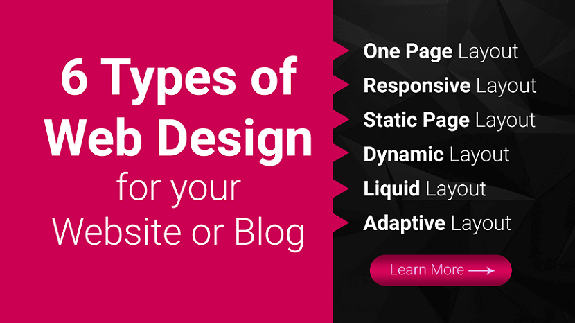
6 Types of Website Design for your Website or Blog
Last updated on January 19, 2025 by RGB Web Tech
With 94% of first impressions relying on website design, you must create a beautifully crafted website for your business or blog. But when you get started with web design service or looking for a web design package, you may not know what approach to take with your website. What types of web design are best for your business or blog?
Luckily for you, we have got all the answers. Keep reading to learn about six types of web design and the pros and cons of each:
- One Page Website
- Responsive Website
- Static Website
- Dynamic Layout
- Liquid Website
- Adaptive Website
Plus, we will cover the different types of websites you can create, so you can determine which one is best for your business! Need some marketing inspiration?
Subscribe to our email newsletter for more updates!
6 Types of Web Design for your Website or Blog
Ready to build your website but are not sure which web design format is best? Here are six of the most common web design layouts for your business and the pros and cons of each.
1. One Page Website
We will cover on our list of types of web design as a one page layout website. As the name implies, a one page layout website uses only a single page that users scroll down to find information about your products or services. With this design layout, you can have a “Navigation Menu” with links to specific points of your page.
Pros of Single Page Website:
- Easy to create.
- Can help you create a clean and simple website.
Cons of Single Page Website:
- Can not be used for businesses that sell products online.
- Can not be used for companies that need multiple pages.
- Can deter people away if the single page is too long and requires too much scrolling.
2. Responsive Website
Next on our list of types of website layouts is responsive design layout website. This layout format is the most popular type, as it allows your site to accommodate all devices and fill the browser size perfectly. Responsive design is built with a mobile first approach.
You create your mobile layout first, and then you expand your website for bigger browser sizes. So instead of trying to trim down your website and make it smaller, you start small and build it bigger.
Pros of Responsive Website:
- Get a website that’s built for mobile users.
- Delivers a seamless experience on all devices.
- Do not have to build a separate mobile site.
Cons of Responsive Website:
- Takes more time to build and develop.
3. Static Website
Most basic type of website design is a static page layout website. With this layout, you build a website with pre-set page dimensions. It has a permanent width. Static layouts stick to these dimensions, regardless of the browser or device type.
Static layouts have phased out with the rise of mobile usage. Since these sites do not adapt to devices, they do not provide a positive user experience on smartphones or tablets. While static layouts are still an option, you typically do not want to use them unless you are creating a completely separate mobile version of your site.
Pros of Static Website:
- Easy to set up.
Cons of Static Website:
- Not responsive to devices or browsers.
- Requires creating a separate mobile site (more work).
4. Dynamic Website
When you look at a list of the types of web design, you will see that the dynamic website layout is an option. Dynamic website layouts are great for people who do not have extensive HTML knowledge. These websites can deliver different content to website visitors, even if two separate people look at the same page.
With a dynamic website vs. static website, you build a database of information and features. Then, when a user requests a page, the web coding automatically works to put the components together from your database to form the webpage.
Pros of Dynamic Website:
- Interactivity with users.
- Increased functionality for users.
- Less coding skills required.
Cons of dynamic Website:
- Can be more complex to set up with different functionalities.
- Tend to load slower because of all the different elements and page compositions.
5. Liquid Website
Next on this list of types of website design is liquid design layout website. This layout, also known as Fluid Design, uses flexible units rather than the fixed units static layouts use. Since the units are flexible, the page will always fill the width with the device’s screen, regardless of what device it is.
Because user experience is critical to your site driving and engaging traffic, liquid layouts have also started to phase out as a viable option for businesses. While you can still use this layout, you risk delivering a poor user experience from your site stretching too far or squishing information together on the page.
Pros of Liquid Website:
- Easier to set up than responsive design
- No information gets cut off on pages
Cons of Liquid Website:
- If a browser is really wide, information gets stretched to fit the screen and can look unappealing
- If a browser is smaller, information gets smooshed together to fit the screen, making it difficult to read and browse
6. Adaptive Website
One web design format you can use for your site is adaptive website layout. As the name implies, this website uses CSS queries to adjust the website’s size to detect the size of the browser. Adaptive websites will automatically alter the website’s layout to provide the best user experience for visitors.
With adaptive website layouts, there are set parameters for how a website will adjust. For example, a set parameter may look like this: “If the browser is 500 pixels wide, set the main content container for 400 pixels wide.” For example, if you have a website with a two-column layout, the adaptive layout would change into a single-column design on a small browser screen.
Pros of Adaptive Website:
- Easy to set up.
- Takes less development time than responsive layouts.
- Can adjust your website according to each browser size.
Cons of Adaptive Website:
- Device widths in between set points can cause your site to have too much space or not enough space.
- Is not fully responsive.
Types of website layouts
Here is a list of different website layouts and which sites benefit the most from them:
1. F-shape layout
The f-shape layout creates a website design that follows the general viewing pattern of the site's visitors. Scientific studies have found that website users often view and move their eyes across a web page creating an F or E shape. Webpages that design their layout to match those instinctive eye movements can help capture visitors' attention more naturally. These types of layouts are most common for websites that display a lot of options for users to choose from, such as news websites and search engines, allowing users to scan the options quickly and make a decision.
2. Z-shape layout
The z-shape layout is very similar to the f-shape layout, except it targets a different group of individuals. Scientific studies have shown that individuals from western cultures use a z shape with their eyes more often than an f shape to navigate the pages of different websites. Z-shape layouts are often most effective for websites that have a singular goal, such as having consumers sign up for a service or purchase a product. Creating a button that navigates users to the next step of company interaction and placing it along the z-shape path can help increase customer outreach and revenue.
3. Grid of cards layout
A grid of cards layout displays information in a grid system that users or website visitors can easily manipulate by adjusting the size of the browser window or screen. Some of the most common sites that use a grid of cards layout are video streaming websites that display image previews for their different video options. They display each of the previews as cards in a grid system, and the number of visible video options changes based on the size of the screen.
A grid layout is great for websites, like video streaming services, that display a lot of options and information of equal value, which can help users find what they're looking for more easily.
4. Boxes layout
The boxes layout uses one larger box as a website's header, which displays an image and two smaller boxes underneath that provide additional images or information for users. Each box gives the user important or engaging information about the company's or website's purpose and links the user to other dynamic web pages they can explore to find more helpful information. Because the boxes can prominently display images, artists often use this layout to show their portfolio and businesses use it to display featured products.
5. Split screen layout
A split screen layout divides a website into two sections that users can choose to explore. This layout works well for companies and organizations that have two pieces of content that are equally important to their business and consumers. For example, a clothing company that sells women's and men's clothing might use the split screen layout to advertise their products. Having both options on the front webpage can allow users to pick which one they're looking for quickly and continue exploring the site.
6. Fixed sidebar layout
The fixed sidebar layout places a stationary menu of options for users on the left or right side of the webpage. This sidebar menu provides visitors with quick and helpful navigation choices, allowing them to explore the website more easily. The fixed sidebar layout often works best with websites that have a limited number of webpages to choose from, such as businesses that sell one major product. For example, if a company that sold watches used a fixed sidebar, some of their menu options could include: about us, online store and contact us.
7. Magazine layout
The magazine layout uses a design that resembles printed publications. This design displays a lot of information to visitors by using a system of columns and grids to help individuals navigate the webpage more easily. The magazine layout is often used by publication companies to resemble how their product might look in its printed form, which can help create a fun and engaging format for users, motivating them to continue reading and exploring.
8. Asymmetrical layout
Asymmetrical layouts ensure that the webpage promotes an uneven design, meaning one half of the page is often larger than the other. Companies and organizations often use this layout to create an aesthetically pleasing web page while directing users to a certain area of the site.
For example, a business might use the larger section of the website to display an image or company slogan, while using the smaller side to encourage users to fill out their contact information to learn about special sales and promotions. The smaller section often attracts the visitor's attention, encouraging them to engage with the website or company. Because of its ability to entice users, the asymmetrical layout is often used on a website's homepage.
Featured image layout
The featured image layout places a prominent and large image at the top of the webpage to attract users. Most often, the featured image is a picture of a popular product that a company or business is selling. Companies that sell aesthetically pleasing products often use this type of layout to immediately attract visitors' attention and encourage them to make a purchase. For example, a company that sells computers might use a featured image layout to display their computers' design and style.
10. Curated visuals layout
The curated visuals layout uses illustrated images to promote a product or service. Companies and organizations often use this layout to display a certain emotion they want users to feel when they use the webpage. This type of advertising strategy can help consumers feel motivated to interact with the company and possibly purchase their goods and services. Most often, businesses or companies with a complicated service that's difficult to sell might use curated visuals to help ease the experience and relay necessary information to users.
Types of websites
4 Types of websites you can create
In addition to narrowing down your list of types of website layouts to the best one, you also must determine what kind of website you need to create for your business. Every business has different needs, which means your site type may differ from others.
Here are four types of websites you can create for your business:
1. Business websites
First on our list is the type of website you can create as a business website. A business website is a standard site. It contains information about your company and the services you offer. If you do not sell products online, you may also build a business site just to showcase what you offer.
These sites are simple and serve as a hub for people to learn about your business. You can use this website type if you are not selling products on your website. For a business website, you can use any of the types of web design listed above. You will want to choose the ones that help you deliver the best experience for your audience.
2. Blog
Second on our list is the type of website you can create as a blog. Blogs are websites that share helpful information with readers about topics in their industry. While a blog may not be your company’s primary website, you may consider creating a blog site if you are doing content marketing.
Content marketing is a crucial strategy for helping your business grow online and build trust with your audience. You may consider having a separate blog website, or integrating it into your core website to help you take advantage of the benefits of content marketing.
This website type can use any type of web design format, except for one page layout website.
The best types of web design layouts for this website type are adaptive and responsive.
3. Ecommerce websites
Another type of website you can create for your business is an ecommerce website. This website type is best for your business if you want to sell products on your site. Ecommerce sites are built to host product pages, add products to a cart, and complete transactions.
If you’re looking to sell products, this website type is best for your business.
In terms of the best types of web design for an ecommerce website, responsive and adaptive are most suitable for an ecommerce site.
4. Membership websites
The last type of website you can create is a membership website. With this website type, you have a paywall for people to enter. Only people who have a membership can enter your site and see your products.
A1truejobs.com is a membership website example. You must create an account and pay the membership fee and become a member of the site.
If you want to use this website type, you can use two types of web design layouts: adaptive or responsive.
Need help figuring out which type of web design is best for you?
With so many types of web design available, it’s challenging to know which type is best for your business. If you’re feeling overwhelmed with building the best website, RGB Web Tech can help you to create a beautiful web design for your business or blog.
Our team experts can help you craft a beautifully designed website that delivers the best experience for your audience. Ready to build your dream website? Contact us online or call us today at +91-9878585860 to speak with a strategist about our web design services and affordable web design packages
If you found this article helpful, we encourage you to share it on your social media platforms—because sharing is caring! For more information about article submissions on our website, feel free to reach out to us via email.
Send an email
Written by RGB Web Tech
Latest Technology Trends
Latest technology trends shaping the future, including AI advancements, blockchain innovation, 5G connectivity, IoT integration, and sustainable tech solutions. Explore breakthroughs in quantum computing, cybersecurity, augmented reality, and edge computing. Stay ahead with insights into transformative technologies driving innovation across industries and revolutionizing how we live, work, and connect.
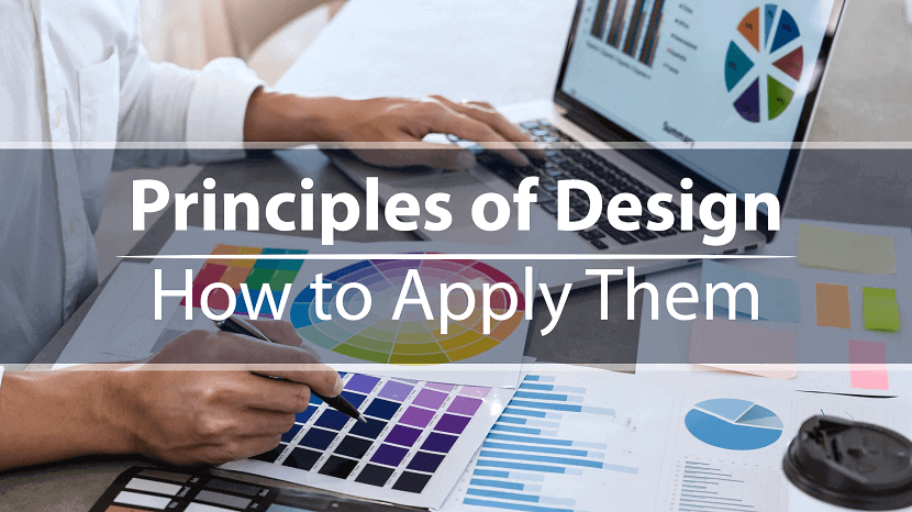
12 Principles of Design & How to works
Last updated on January 19, 2025 by RGB Web Tech
You can’t just flip a switch and create beautiful designs on a whim. Like learning to walk before you run, there are certain fundamentals you’ve got to learn first.
The problem is that if you don’t have the time or inclination to take a design course, resources are pretty scarce. Sure you can rely on Canva templates, but even then you need to know how to use them properly.
This is why we've put together this post. It’s for you if you’ve ever wondered what goes into good design. You'll find it handy whether you're a complete amateur or a budding designer—so let's get stuck in.
What are design principles?
Design principles are guidelines to follow if you want to create effective visuals, from oil paintings and blog graphics to eye-catching social media posts.
Think of design as carpentry and these principles as your toolbox. You can use them to help you during the design process, and unlike hammers, nails and screwdrivers, they can exist entirely inside your head.
These tools give you a better understanding—and appreciation—of what goes into the designs we see every day. As you become acquainted with them, you’ll start to see what does and doesn’t work (and why), as well as how you can apply these principles to your own creative work.
What is "good design"?
We’re told that piece of art is subjective. For the most part, that’s true. But if you’ve ever seen an unintelligible parking sign or a website from the early days of the web, you’ll know there’s definitely such a thing as bad design.
As Jared Spool, an expert on design and usability, says, “good design, when it’s done well, becomes invisible. It’s only when it’s done poorly that we notice it.” This is why good design is tricky to define.
Luckily for us, in the late 1970s, an influential designer named Dieter Rams saw this problem. In response, he asked himself what constituted good design and came up with his own list of ten principles.
Little did he know, they would go on to inspire generations of designers, including Johnny Ive, the mastermind behind Apple’s most famous products.
Rams’s principles are:
- Good design is innovative
- Good design makes a product useful
- Good design is aesthetic
- Good design makes a product understandable
- Good design is unobtrusive
- Good design is honest
- Good design is long-lasting
- Good design is thorough down to the last detail
- Good design is environmentally friendly
- Good design is as little design as possible
You might notice that these principles are aimed at product design. Rams worked at Braun, so products were in his wheelhouse, but these principles are easily adapted to UX, UI, or any other design context.
Rams’s principles aren’t the only principles out there. Other notable design principles include Nielsen’s 10 usability heuristics and Whitney Hess’s five guiding principles for experienced designers.
The 12 principles of design
These are the building blocks graphic designers and artists use to put creative works together; the core principles of art that make up every design, from the fine art of the Louvre to the boxes of Corn Flakes at the local grocery store.
1. Balance
Where objects in real life carry physical weight, elements in design carry visual weight. Large elements are heavier and small elements lighter, with each element having its own "weight" based on how much attention they draw.
Visual balance is about ensuring your design is equally weighted on both sides of the central point. It’s like a seesaw—too much weight on either side and the whole thing becomes unbalanced.
By striking this balance you create visual harmony and stop your design from feeling too chaotic to the viewer. It’s one of the most important parts of visual composition, and comes in three basic forms:
Symmetrical balance
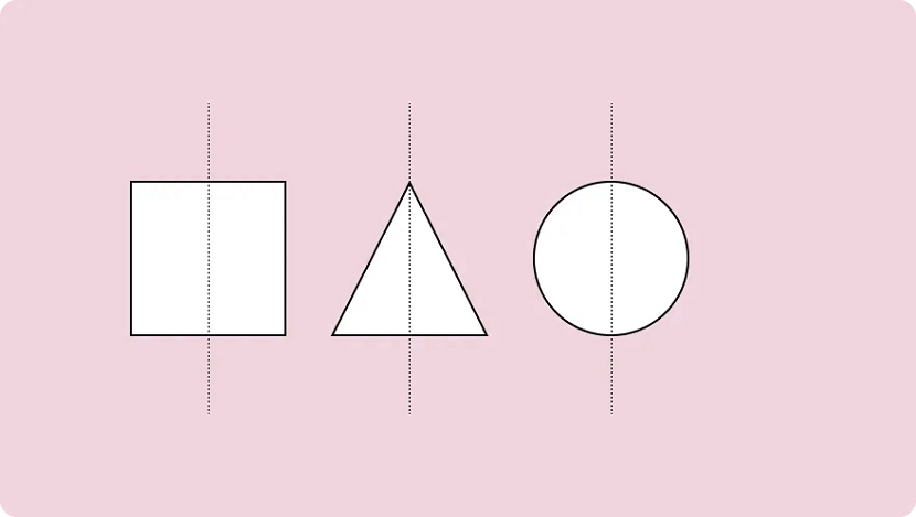
Symmetrical design uses an imaginary vertical (or sometimes horizontal) line to divide a design into two halves around a central point. Elements of equal visual weight are balanced on each side of the axis to create symmetry.
There are two variants of symmetrical balance: Reflectional symmetry, where the two halves are exact mirror images, and translational symmetry, where the same shape or elements are repeated on both sides of the design.
Asymmetrical balance
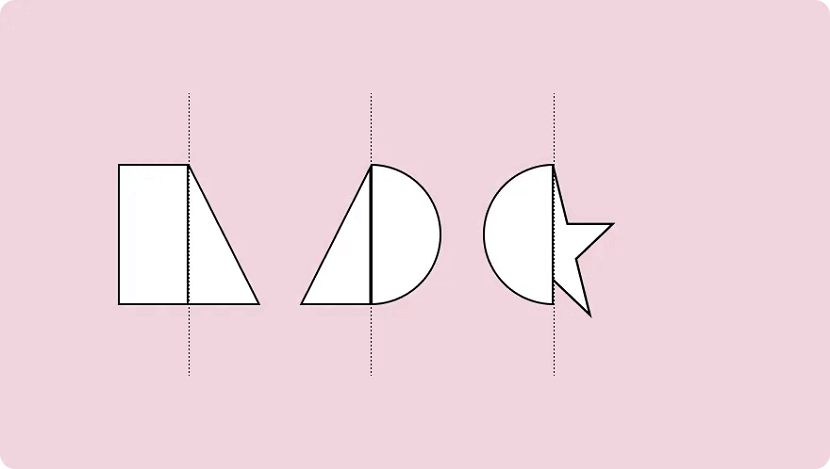
An asymmetric composition is when a design uses unequal weighted elements. One side might have a visually heavy element, balanced with multiple lighter elements on the opposite side.
To run with the seesaw example, it would be like having a 100kg weight on one side and 100 kg of feathers stacked on the other. It still achieves balance but provides a whole different experience.
Asymmetry is often more visually interesting. Where symmetrical designs can be quite static and predictable, asymmetrical balance can give designs a more dynamic feel.
Radial balance
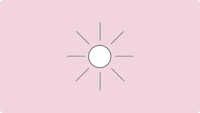
Radial balance is when elements “radiate” from a point in the centre of a design. Think of rays shining from the sun, petals blossoming from a rose, or a squirt of tomato sauce in the middle of a juicy meat pie.
This form of symmetry is a way to add depth and movement to a design and works to draw attention to an object in the centre of a composition.
2. Emphasis
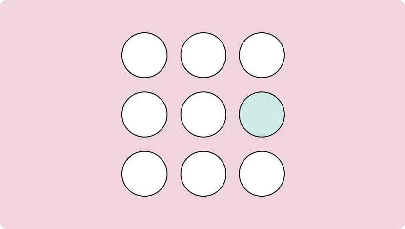
Emphasis is used to focus the viewer’s attention on a certain part of a composition. The effect is achieved by manipulating elements (like colour, shape and size) to make specific parts of a design stand out.
For example, say you wanted to bring attention to a call to action on a landing page. You could increase the text size and use colours that stand out from the background, emphasising the CTA and making sure visitors can’t miss it.
3. Repetition
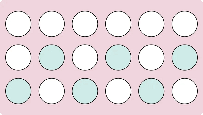
As you may have already guessed, repetition refers to when an element is repeated throughout a design. It could be anything, from using a certain font colour to adding a repetitive pattern to a social media post.
Repetition makes designs visually exciting and cohesive. It also creates a sense of consistency by using a repeating motif that the viewer comes to expect. This makes it particularly useful when it comes to creating your distinct brand identity.
Brand identity is the visible element of your brand. The colours; design; logo. It acts to distinguish your company from the millions of others out there, so when folks see your designs they immediately know it’s your business.
Every successful business uses repetition. Why do we equate the swoosh and “just do it” with Nike? The blue can with Pepsi? Because these visuals were repeated so often that eventually they became synonymous with the brands they represent.
So while repetition can just help you make a sweet iPhone wallpaper, it’s a crucial tool for any company looking to build a visual identity and brand recognition.
4. Movement
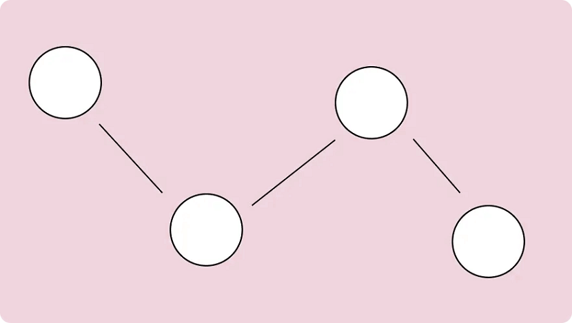
When we think of movement we think of, well, things moving. A pendulum swinging. A Ferrari roaring down the freeway. But in design, it refers to the path a viewer’s eye takes when they look over a composition.
It’s not just what you look at; it’s the way you look at it. Designers can guide this by using lines, edges, shapes and colours to create focal points and encourage certain ways of seeing.
Movement can be harnessed to distract, direct and pull the viewer’s gaze around a design. By using subtle cues (particularly with lighting and perspective) a savvy artist can control this entire process. You can use lines to create directional cues and make images feel more alive.
5. Proportion
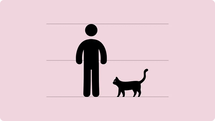
Proportion is the relationship between two or more elements in a design, particularly the size and scale of them. When things are "proportionate”, it means there’s a coordination between them that makes the design look aesthetically pleasing.
For example, when you’re reading a blog post you expect headings to be larger than the body text. Or if you were looking at a realistic drawing of a tortoise and a hare, you expect the hare to be larger than the tortoise.
Proportion is about finding harmony between two elements. You want to make sure things look “right”— that the elements look as if they belong together.
This is something that comes up when creating digital assets and websites online. It’s the bane of many an amateur designer’s existence. Here are a few tips for keeping the elements in your design in proportion:
- Assemble elements that are identical or share a function.
- Establish major and minor areas in the design to prevent monotony and boredom.
- Ensure size variations are subtle (unless the objective is emphasis.) Avoid separating the composition into halves, quarters, and thirds. Try to keep a sense of balance.
You can also play with proportions in a variety of ways to emphasise elements or get a certain message across. It’s a strategy you’ll notice advertisements do often and is usually best used for more creative projects.
6. White Space
\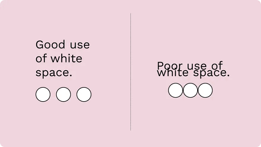
The region between different design elements is referred to as "negative” or “white” space. This is part of the design that doesn’t contain anything. No images, drawings, shiny colours or text. Nothing.
The name is kind of misleading — it’s not a "negative" thing and it doesn’t have to be "white". It can be any colour: white space refers to what you don’t add; the empty parts around and within your design.
It’s one of the fundamental building blocks of design and is just as important as any elements you do include. Think of it like a diet: what you eat matters, but what you don’t eat matters just as much.
“White Space in design composition is the same as the use of silence in a musical composition. Without proportionate use of silence, music is unstructured. Similarly, without white space, design is unstructured and difficult to consume." — Mark den Hartog
There are two types of white space: micro and macro. Micro white space is the space between small elements (like text), while macro white space refers to the area between large elements or surrounding a design.
7. Contrast
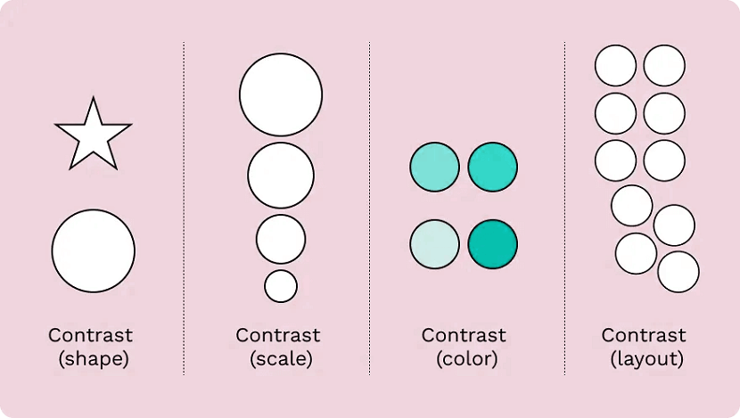
Contrast is produced when two or more visual elements in a composition are different. It can be used to create specific effects, emphasise the significance of certain elements, and add visual appeal to your designs.
Designs that look the same are boring—by experimenting with contrasting colour hues, shapes, sizes, textures and typography, you can liven things up. Humans tend to like contrast. It’s a great way to grab attention, control the visual flow and keep folks engaged.
Keep in mind that adding too many variations can be confusing for viewers (the opposite effect you want to have.) As with most of the different elements of art, it’s about striking a balance.
8. Hierarchy
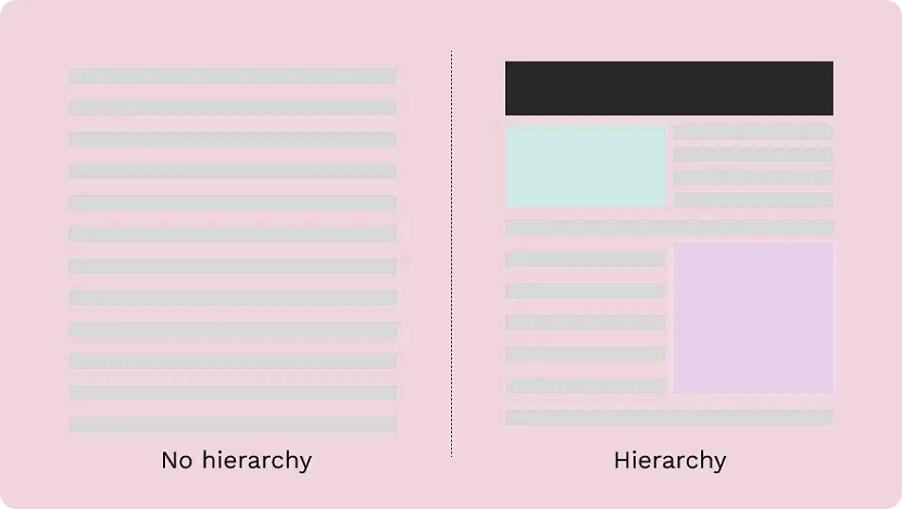
Visual hierarchy is about organising the value of the elements within your design. By ranking information from most important to least important, you make it easier for the viewer to digest your content.
This plays a critical role in UI and UX design. Ever noticed how most landing pages have the same layout? There’s a logo at the top, a menu at the top and then elements in descending order of importance below.
It’s not because they copied each other's homework—there’s a certain hierarchy that designers stick to in order to draw attention to the right things in the right order (and make it pretty to look at.)
The viewer’s eye should be drawn to the most important element first. These sit atop the throne at the top of the hierarchy, with the elements laid out below ranked in order of importance.
There are a number of visual tricks to influence this flow, including:
- Size and scale: The larger an element is the more likely a viewer is to see it. By making something smaller you can reduce its importance and put the emphasis elsewhere.
- Colour and contrast: A splash of colour makes a big difference. Use bright colours to make certain elements or information pop.
- Fonts: Use different typefaces and stylisations like italics and bold to draw the eye and move text higher or lower on the hierarchy.
- White space: White space enables you to give an element breathing room and make a central element stand out.
Patterns of hierarchy
People read a page in the same way: from top to bottom. But we don’t just stare blankly at s page and wait for information to register, we scan it.
The human eye tends to follow the same path during this process. For that reason, designers stick to two common patterns to make it faster to absorb information: the F-pattern and the Z-pattern.
The F-pattern applies to pages made up mostly of text, like an online or printed article. Readers scan in the shape of an “F”—first, with the headline across the top, then down the left side of the page and to the right as they identify things they find interesting.
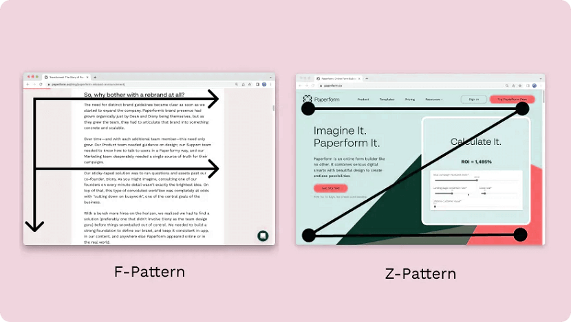
Designers use a Z-pattern for layouts with less text and more visuals. With this pattern, viewers scan across the top of the page and then diagonally down towards the opposite corner. They then scan the bottom in the same way as the top.
Most websites are designed in this way (including Paperform). Notice how the most important parts like the logo and navigation menu are at the top, while the secondary information like clients and chatbot is at the bottom.
9. Rhythm
Don’t worry, you can leave your dancing shoes at home. In design, rhythm hasn’t got anything to do with the way you move your hips. It’s about giving your composition a feeling of action and movement.
Designers create rhythm by repeating lines, shapes, colours and other elements. This makes a path for our eyes to follow, builds patterns and imbues the design with a sense of flow. There are a few different types of rhythm:
- Random rhythm: Repeating elements without any regular interval.
- Regular rhythm: When the elements are of a similar size and length and spread out over predictable intervals.
- Flowing rhythm: Natural patterns where the intervals are organic (like a tiger’s stripes or a bunch of flowers in a garden.)
- Progressive rhythm: A gradual change or sequence of elements that change over a series of clear steps (like a colour gradient for example.)
Rather than letting the viewer’s eye settle on a focal point, rhythm encourages viewers to move their eyes across the entire piece, following the lines and forms to their natural endpoints. It’s something you see reflected across nature and works of art.
10. Pattern
People tend to get confused between repetition in patterns, which is understandable, as they both deal with repeated elements. But the similarities end there.
While repetition occurs when the same elements are repeated throughout a design, a pattern is composed of different components repeated in the same way. Think of the way gift wrapping is usually made up of a few different repeated elements—that's a pattern.
You'll also notice patterns commonly used as backgrounds on websites and in mobile applications.
As a general rule, it's best to use colours, textures and shapes to create patterns. Try to avoid doing so with words — it tends to just give folks headaches. Despite the occasional bright colours and wacky designs, the key to creating effective patterns is simplicity.
11. Variety
Variety isn’t just the spice of life—it’s the spice of design too. It’s integral not to revert to the same old elements within a design to make sure things are visually interesting for your viewers.
Variety keeps things engaging. It stops designs from being stagnant, predictable and downright boring — all things you want to avoid. By making sure elements are varied you stop designs from feeling monotonous and uninspired.
The easiest way to do this is through juxtaposition and contrast. Place bright colours next to lighter hues, text next to images, and round shapes next to square ones. By doing so you can keep viewers engaged and your design interesting.
12. Unity
We've put unity last on this list for a reason—it only occurs when all the various elements within a design coexist to form a holistic experience that’s pleasing to the eye.
Unity adds order and makes a piece feel like a coherent whole, instead of a messy combination of individual parts that just so happen to exist on the same page. It's developed both visually and conceptually.
- Visual unity. An extension of “harmony”, is about elements working together, like colour schemes, the use of complementary styles, and in some cases, the repetition of colours and elements to achieve consistency. An example would be using the same colours for all the buttons on a webpage to keep the design cohesive.
- Conceptual unity. Is when you combine elements for the user’s convenience; it’s about blending form and function in a natural way. An example of this is how you can double-tap on Instagram to “Like” an image—it reduces friction and requires less action from the user.
To achieve unity you need to look out for three things: whether the elements you’ve used have a good reason to be there, whether they work together, and whether the message or concept you’re trying to display is communicated clearly.
By making sure your designs unite you reduce cognitive load and ensure viewers actually understand whatever it is your design is trying to achieve.
Put these design principles to work
Hopefully, these 12 design principles can help inspire you to take your creative work to the next level.
No matter what you’re designing—from product pages to actual products—if you take the time to learn and apply these concepts you’ll be firmly set on the path to success.
Remember, design is always evolving. Look at what other people are doing and think about how you can apply their techniques to your own work: it’s a great way to hone your design skills.
Now, all that’s left is to put your creative cap on and create your own work of art. Happy creating!
If you found this article helpful, we encourage you to share it on your social media platforms—because sharing is caring! For more information about article submissions on our website, feel free to reach out to us via email.
Send an emailWritten by RGB Web Tech
Latest Technology Trends
Latest technology trends shaping the future, including AI advancements, blockchain innovation, 5G connectivity, IoT integration, and sustainable tech solutions. Explore breakthroughs in quantum computing, cybersecurity, augmented reality, and edge computing. Stay ahead with insights into transformative technologies driving innovation across industries and revolutionizing how we live, work, and connect.
Unlocking Success: How Web Design and Development Impact Your Online Presence
Last updated on January 19, 2025 by RGB Web Tech
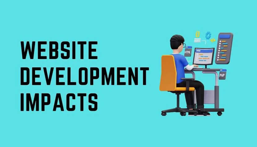
In the era of rapid digital advancements, establishing a formidable online footprint becomes imperative for the triumph of any business venture. A meticulously crafted and expertly engineered website can potentially wield a profound impact on the perception of your brand, ultimately ushering you toward the gateway of triumph. Within the confines of this article, we shall delve deep into the realm of web design and development, unraveling its intrinsic capabilities to instill a positive transformation in your virtual presence. Brace yourself as we commence this enthralling odyssey toward attaining boundless success!
The Power of First Impressions
In the realm of your website, initial impressions hold immense significance. Studies have revealed that mere seconds are all visitors take to shape their perception of your site. Hence, it becomes paramount to fashion a design that is visually enchanting and user-friendly, seizing your audience's attention right from the moment they land on your virtual domain.
An aesthetically captivating framework, complemented by alluring imagery and captivating content, possesses the power to leave an indelible mark on your visitors. It conveys a sense of professionalism, credibility, and reliability, all of which are pivotal elements in establishing a robust online presence.
Navigating the User Experience
The success of a website is intricately tied to the user experience (UX) it offers. The seamless flow of navigation, an intuitive interface, and flawless functionality collectively contribute to a positive user experience. It is imperative that visitors can effortlessly find the information they seek, devoid of any sense of confusion or frustration.
The user experience can be considerably improved by adding simple navigation menus, clear call-to-action buttons, and strategically arranged content. By placing utmost importance on user experience during web design and development, you can effectively captivate and retain your audience, minimize bounce rates, and maximize conversions.
Mobile Optimization: A Must-Have
In an era dominated by the ubiquity of smartphones and tablets, optimizing your website for mobile devices is not merely a choice—it has become an absolute necessity. Neglecting the necessity of mobile optimization can seriously harm your online presence because a substantial amount of internet traffic comes from mobile users.
Responsive web design ensures the seamless adaptation of your website to diverse screen sizes and resolutions. It guarantees a consistent and intuitive user experience across a myriad of devices, thereby empowering mobile users to navigate and engage with your digital domain effortlessly. By embracing the essence of mobile optimization, you can extend your reach to a broader audience while concurrently enhancing your search engine rankings.
Leveraging Social Media Integration
Social media has become an inseparable part of our daily lives in our modern interconnected world. Harnessing the power of social media integration in your web design and development endeavors can revolutionize your online presence.
By seamlessly integrating social sharing buttons on your website, you can actively encourage and empower visitors to effortlessly share your valuable content with their extensive networks. Furthermore, real-time social media feeds display allows you to showcase captivating updates and actively engage with your cherished audience. By forging a solid and seamless connection between your website and various social media platforms, you can expand your reach, nurture unwavering brand loyalty, and attract a fresh influx of new followers.
Consider using QR codes as a cutting-edge and creative strategy as well. By strategically incorporating QR codes into your web design, you can provide a quick and convenient way for users to access and share your website or specific content. QR codes act as a bridge between the physical and digital worlds, enabling effortless interaction and expanding the potential for connection with your target audience.
Search Engine Friendliness: Climbing the Ranks
Unleashing triumphant outcomes within the digital landscape necessitates a profound grasp of the indispensability of search engine optimization (SEO). A meticulously optimized website can heighten your visibility in search engine results, propelling organic traffic and magnetizing prospective clientele.
To augment the search engine friendliness of your website, integrate pertinent keywords seamlessly into your content, meta tags, and headings. Skillfully employ appropriate HTML tags, such as H1, H2, and H3, to meticulously structure your content, thereby endowing search engines with a clear comprehension of your website's hierarchical framework. Additionally, craft descriptive and succinct meta descriptions for each page, enthralling users and enticing them to click through to your digital abode fervently. By meticulously implementing these SEO strategies, you can fortify your online presence and unlock the gates to unrivaled success.
Enhancing Loading Speed: Faster Than a Blink
In the contemporary whirlwind of our world, swiftness reigns supreme. Research unequivocally demonstrates that users demand websites to load swiftly within two seconds or less. Any semblance of delay in loading speed can elicit exasperation, urging visitors to forsake your digital abode in favor of a nimbler alternative.
Optimizing your website's loading speed is an imperative measure to avert the potential loss of visitors. Embrace techniques such as image compression, minimizing HTTP requests, and harnessing caching mechanisms, as they wield power to enhance loading times significantly. By according to the importance to speed within your web design and development endeavors, you can seamlessly bestow a browsing experience without hindrance, thereby ensuring the unwavering engagement of your cherished users.
Maximizing Accessibility for All
Web accessibility is a paramount facet of web design and development that must never be disregarded. Ensuring the accessibility of your website to individuals with disabilities resonates not only as an ethical imperative but also as a legal mandate in numerous jurisdictions.
Incorporate proper HTML tags, furnish an alternative text for images, and employ descriptive link texts to facilitate users utilizing screen readers. Deliberate upon color contrast to enhance readability and extend keyboard navigation options to cater to those unable to hire a mouse. By rendering your website accessible to all, you exhibit an unwavering commitment to inclusivity, fostering a positive online presence that reverberates with the utmost integrity.
Conclusion
Realizing unprecedented triumph within the digital realm necessitates acknowledging the profound influence of web design and development on your online presence. According to the paramount importance of factors such as visual allure, user experience, mobile optimization, search engine friendliness, and accessibility, you pave the way for creating a captivating website that magnetizes and enthralls your intended audience. Remember, your website serves as the digital countenance of your brand, and investing in its design and development catalyzes your unparalleled accomplishments in the online sphere.
If you found this article helpful, we encourage you to share it on your social media platforms—because sharing is caring! For more information about article submissions on our website, feel free to reach out to us via email.
Send an emailWritten by RGB Web Tech
Latest Technology Trends
Latest technology trends shaping the future, including AI advancements, blockchain innovation, 5G connectivity, IoT integration, and sustainable tech solutions. Explore breakthroughs in quantum computing, cybersecurity, augmented reality, and edge computing. Stay ahead with insights into transformative technologies driving innovation across industries and revolutionizing how we live, work, and connect.